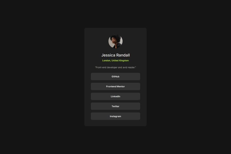
Design comparison
SolutionDesign
Solution retrospective
What are you most proud of, and what would you do differently next time?
I'm proud of how it ended up looking. I'm not sure what I can improve but I guess I could make it a bit more adjusted for other devices, smaller ones in particular.
What challenges did you encounter, and how did you overcome them?Making it responsive enough. I'd had problems making it look good on smaller resolutions but I overcame it.
What specific areas of your project would you like help with?I'm not sure. I'd like to know when to use padding and when to use width/height for page elements.
Join our Discord community
Join thousands of Frontend Mentor community members taking the challenges, sharing resources, helping each other, and chatting about all things front-end!
Join our Discord
