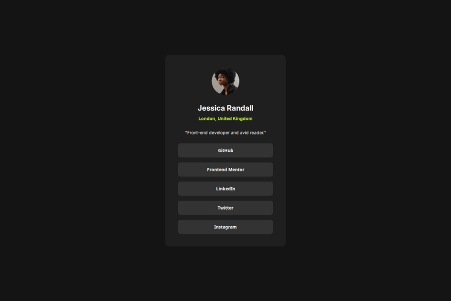


Design comparison

Solution retrospective
I am most proud of successfully implementing the social links profile with a clean and structured design that closely matches the original challenge. The use of CSS variables for colors improves maintainability, and the flexbox layout ensures proper alignment and spacing. Additionally, the responsive design adapts well to different screen sizes.
If I were to improve this project, I would:
- Enhance accessibility by ensuring correct
roleattributes and using<nav>for social links instead of a<div>. - Use semantic HTML elements, such as replacing
<div class="bio-txt">with<p>for better readability. - Explore alternative layout techniques, such as CSS Grid, to see if it provides additional flexibility.
- Challenge: Managing colors dynamically using CSS variables.
- Solution: Declared color variables in
:rootfor reusability and easy updates.
- Challenge: Ensuring the profile card scaled well on smaller screens.
- Solution: Used media queries (
max-width: 375px) to adjust width and padding for mobile users.
- Challenge: Keeping button styles consistent and ensuring they looked balanced within the profile card.
- Solution: Applied uniform padding, border-radius, and spacing for consistency.
I would appreciate feedback on the following areas:
-
CSS Best Practices:
- Are there better ways to structure my CSS for scalability and maintainability?
- Should I consider using
remoreminstead of fixed pixel values?
-
Accessibility Improvements:
- Are my
roleattributes correctly assigned, or should I use more semantic elements? - Would adding ARIA attributes improve accessibility for screen readers?
- Are my
-
Alternative Layout Strategies:
- Would CSS Grid be a better approach for structuring the profile card?
- How can I improve responsiveness without relying too much on media queries?
I appreciate any suggestions or feedback to refine this project further! 🚀🎨
Community feedback
- P@r0b3rtcode020Posted about 2 months ago
Your solution is very good, congratulations. Just a small tip for your media queries: instead of using (max-width: 375px) for example, you could use (width <= 375) which I consider easier to read and understand. I’m referring to the structure because, for instance, if you had the following: @media(min-width: 376px) and (max-width: 767px) {...}, you could instead use: @media(375px < width < 768px) {...}
0 - P@TempperPosted about 2 months ago
Both Flexbox and CSS Grid have their strengths. While Flexbox is excellent for one-dimensional layouts, CSS Grid shines in creating two-dimensional layouts and can provide more granular control over both rows and columns. If your profile card’s layout becomes more complex, experimenting with CSS Grid might offer you additional flexibility. To improve responsiveness without over-relying on media queries, consider using fluid layouts with CSS functions like clamp(), min(), and max(). This can help you create a more dynamic design that adjusts smoothly across various screen sizes. Overall, you’ve done a fantastic job with both the design and the technical challenges. The fact that you're already considering further improvements shows a great commitment to refining your skills. Keep up the excellent work!
0


Please log in to post a comment
Log in with GitHub
Join our Discord community
Join thousands of Frontend Mentor community members taking the challenges, sharing resources, helping each other, and chatting about all things front-end!
Join our Discord