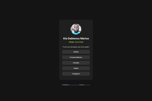
Social links profile

Solution retrospective
I proud of the end result. It looks like the end result, so it's something to be proud of. Next time I would like to use a framework and improve my skill working with different things but at the time, I don't know any framework yet.
What challenges did you encounter, and how did you overcome them?This is my third challenge and it's like the other one I did so I didn't encounter many challenges. I center the card with flexbox property and Its look great.
What specific areas of your project would you like help with?This time, I use div like other learners advised me last time and then I use an unordered list for the links. Please, if there's something I maybe did wrong, and if you have some trick that work well. Let me know. Thanks for your feedback, Its mean a lot.
Please log in to post a comment
Log in with GitHubCommunity feedback
No feedback yet. Be the first to give feedback on Kla Marius's solution.
Join our Discord community
Join thousands of Frontend Mentor community members taking the challenges, sharing resources, helping each other, and chatting about all things front-end!
Join our Discord