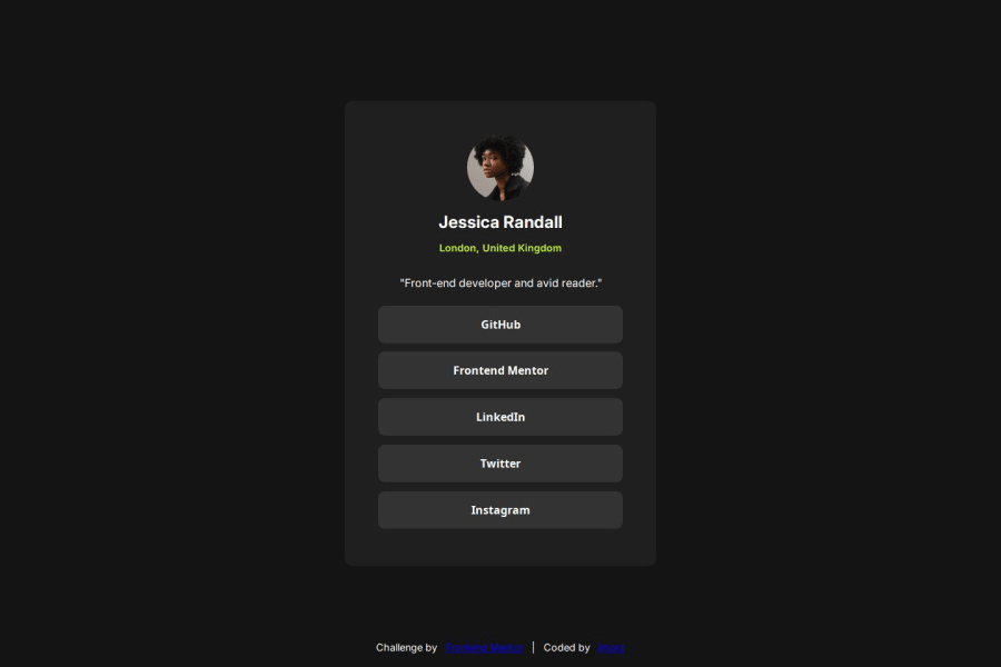
Design comparison
Solution retrospective
Using rem for sizes and using the var() for the colors
What specific areas of your project would you like help with?Feedback appreciated! Just want to know if there is need for improvements to my CSS
Please log in to post a comment
Log in with GitHubCommunity feedback
- P@Fable54321
Ok, so just opened your code.
-1- I'm seeing variables at the top of your CSS, I love it. It is an easy way to make sure right from the beginning that you are not going to forget something and/or use a wrong value, good job ! Now I would like from you to start looking at how you could use them more. For instance for your typography and in some cases even for your spacings across one project :).
-2- Just another tip, you can type CSS reset on google and copy/paste the code at the top of your CSS file. A CSS reset is a way to avoid any unwanted behavior that is cause from "pre-built" CSS. For example, I use the one from Kevin Powell and what I like from his is that there is a min-height of 100vh set to the body and the h1,h2,h3,h4 don't have particular stylings anyways, because you should never rely on a tag to style anything.
-3- I can see that everything seems a bit bigger on your design, but everything looks proportional so it's still looks really good. Depending on if you have the figma file or not, it can be really finicky to get everything excatly the right size.
-4- Now I know at this stage of your journey you might not have gotten really into responsive web design yet, but I will still give you advice, because this will soon become the major thing you'll have to focus on. You current design isn't responsive, as in once you get to these lower screen sizes, the site start not adjusting well. Generally we want a website to look good to as low as 320px of screen width(sometimes it might even be 300, like on the challenges here.).
Now on your site there would have been a realy easy fix (at least from what I'm seeing). You have used fixed widths, instead you should think of using max-width, this way it allows elements to shrink when required. Fixed widths are fine for really small elements, like a little icon, but in general it's good to avoid it.
I woudl say overall this is a solid looking page, good job, keep up !
Marked as helpful
Join our Discord community
Join thousands of Frontend Mentor community members taking the challenges, sharing resources, helping each other, and chatting about all things front-end!
Join our Discord
