

Design comparison

Solution retrospective
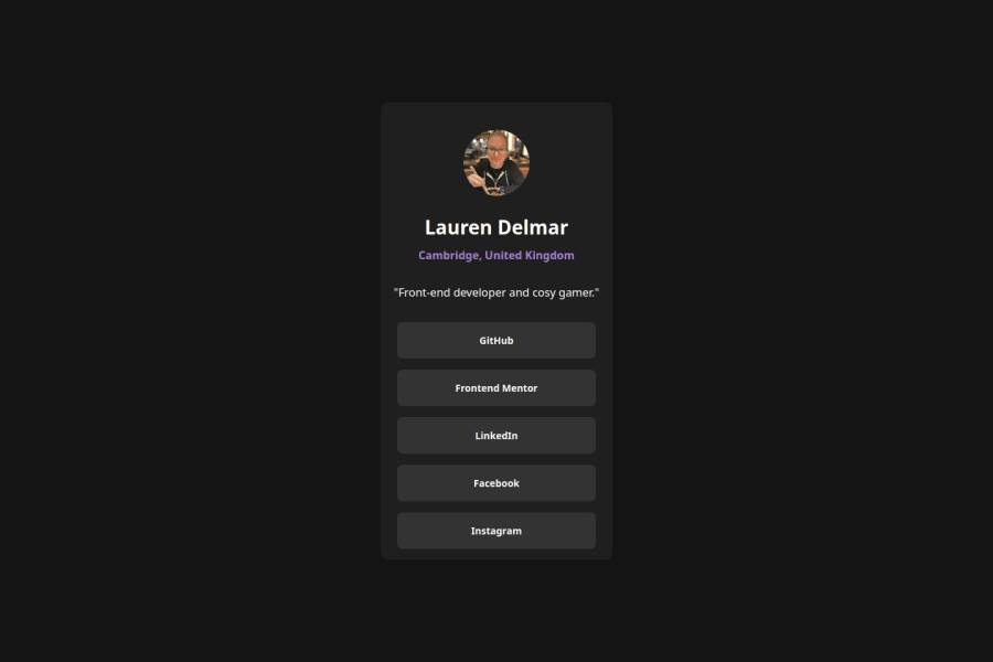
I am pleased with the look and function of the social card. I customised it for myself. Made sure the contrast is accessible and focus works for keyboard. I made the card work for mobile-first, it scales according to screen size.
What challenges did you encounter, and how did you overcome them?Had some issues with the appearance of the buttons and their alignment. Used flex, gap and space-around as a solution.
What specific areas of your project would you like help with?Is there something more I could do in terms of responsiveness? I can see it scales appropriately for larger screens and mobiles but it doesn't adapt as I change the size of my window. Is that necessary?
Community feedback
- @Grimm-NPosted 5 months ago
Incredible work—I’m seriously impressed! 🤩 I’ll be following your projects for sure! 🚀
If you're open to some tips:
- You’re already using
remandem, which is great! Try using them (and similar units) everywhere. Relative units make your layout more adaptive, so it scales well across different devices.
For the links: using flexbox is perfect for simple vertical alignment, but CSS Grid can also be an easy option if you want a single column with 4 equal rows. Here’s how:
.container {
  display: grid;
  grid-template-rows: repeat(4, 1fr); /* 1 column, 4 equal rows */
  gap: 1rem; /* space between links */
}
With Grid, you get clear control over row sizes and spacing—ideal for arranging your links!
Marked as helpful1 - You’re already using

Please log in to post a comment
Log in with GitHubJoin our Discord community
Join thousands of Frontend Mentor community members taking the challenges, sharing resources, helping each other, and chatting about all things front-end!
Join our Discord