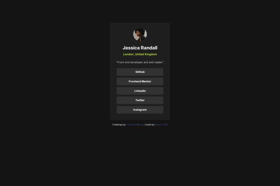
Design comparison
Solution retrospective
Well, one thing I'm proud of is that I have been doing this since the first challenge so I already know where I was headed, that way it wasn't hard to handle. Also I want to give a quick thanks to the developers that helped me with my last solution on flexbox (@MohammadSoleimanikia and @mahbt) I didn't have an issue using flex-box this time due to your suggestions on my previous project and it saved me a lot of build time :)
What challenges did you encounter, and how did you overcome them?For my challenges on this project, I had issue making each buttons seat on their own line.. I was using flex but they were all seating close to each other.
How'd I overcame this? Well I opened my chrome developer's tool to mess around with the display positioning a little, I was trying out different options then when I tried 'Grid' it worked perfectly.
So instead of [display: flex] I did [display: grid] and it worked perfectly for me! :)
What specific areas of your project would you like help with?Any is fine, more tips and tricks to make build faster is highly appreciated thank you. :)
Please log in to post a comment
Log in with GitHubCommunity feedback
- P@MikDra1
If you want your solution to be just like the design shows I encourage you to use Pixal Perfect extension
Hope you found this comment helpful 💗💗💗
Good job and keep going 😁😊😉
Marked as helpful - @TedJenkler
Hi @popcorn150,
Nice project! Here are a few additional recommendations:
OG Meta Tags: I strongly recommend using OG (Open Graph) meta tags to improve SEO and the shareability of your site. Proper OG tags can significantly impact how your site appears when shared on social media and can make a difference in search engine ranking, potentially even affecting whether your site appears in search results.
Footer Positioning and Text Size: Consider positioning your footer absolutely at the bottom of the page using position: absolute and bottom: 0. This will ensure it stays at the bottom regardless of the page content length. Additionally, increasing the text size in the footer can improve readability, especially on desktop screens.
ARIA Labels: When semantic HTML elements aren't applicable, make sure to add aria-label attributes to your <div> elements. This practice enhances accessibility and contributes positively to SEO by helping screen readers understand the content and purpose of these elements.
Keep up the great work!
Best, Teodor
Marked as helpful - P@makogeboris
Nice work @popcorn150, here are a few things to review
- Use a separate file for your CSS as it improves maintainability.
- All content should be wrapped within landmarks. Wrap a main
tagaround the .main-container and afooterfor the attribution. - To improve the semantic meaning of these social media links, you should use the
a(anchor) tag instead of thebuttontag. Theatag is used for navigation to other pages, while thebuttontag is designed for interactive actions like submitting forms or for events like toggling content. Also, using an unordered listulto group the social media links is a better approach for both semantics and accessibility. - Font-size should be written in
remnot px. This article explains it better Why font-size must NEVER be in pixels. - Consider using a modern CSS reset at the start of the styles in every project. Like this one Modern CSS Reset. This will help reset a list of default browser styles.
Good luck!
Marked as helpful - @cas1092
overall the design is correct, aparently we both had issues with the sizing (your's too small, mine too big), maybe add some padding to your card i fell it's a little 'skynny'.
Sorry for the slim feddback but i'm very junior on this
Marked as helpful
Join our Discord community
Join thousands of Frontend Mentor community members taking the challenges, sharing resources, helping each other, and chatting about all things front-end!
Join our Discord
