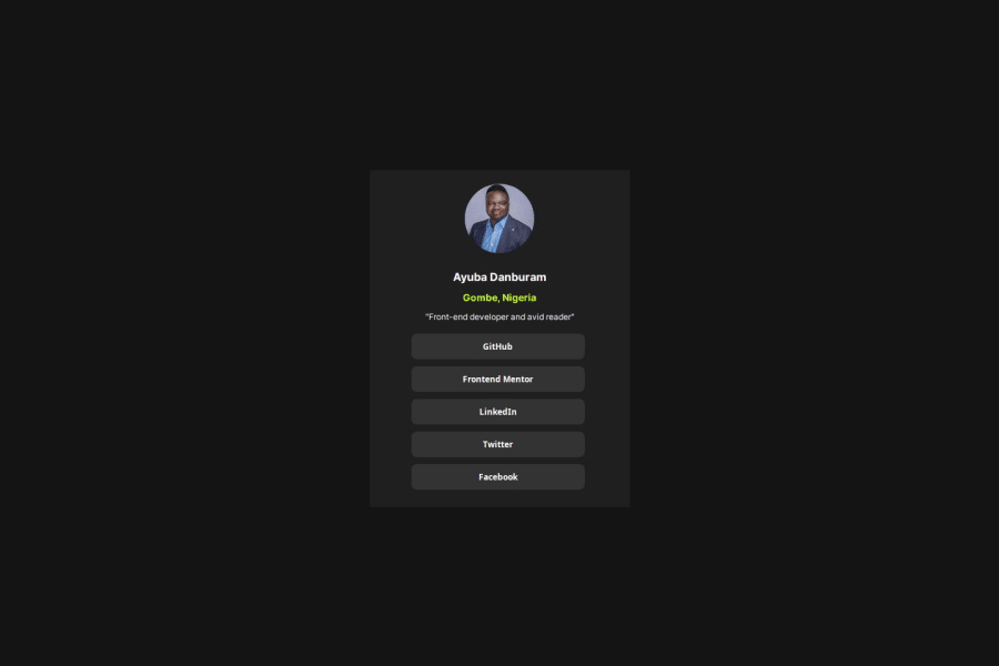
Design comparison
Solution retrospective
Despite having no access to the Figma design I was able to implement the design with a very high accuracy.
What challenges did you encounter, and how did you overcome them?The challenge I encountered was getting my measurements and font size because I had no access to the Figma design. I overcame it by trying several values and font sizes.
What specific areas of your project would you like help with?I think I am good
Community feedback
- @RanitManikPosted 5 months ago
Hey there! I noticed a few issues while reviewing your site:
-
Image Aspect Ratio: You've set explicit width and height for images, which is great for consistency. However, this causes the images to stretch unnaturally. Consider using
object-fit: cover;
for images to maintain their aspect ratio while filling the container appropriately.img { object-fit: cover; }
-
Centering the Container: Instead of using
margin-top
on.container
to center it vertically, a more effective method is to usemin-height: 100vh;
onbody
anddisplay: grid; place-items: center;
to center.container
. This approach ensures better responsiveness and alignment.body { min-height: 100vh; display: grid; place-items: center; }
-
Active State for Links: When hovering over links, the background color changes, but the text color remains unchanged. Ensure that the text color also adjusts in the active state to maintain consistency and improve usability.
a:hover { background-color: /* your hover color */; color: /* adjust text color for readability */; }
I hope you find these suggestions helpful for improving your site's design and functionality. Feel free to reach out if you have any questions or need further assistance!
Marked as helpful0 -
Please log in to post a comment
Log in with GitHubJoin our Discord community
Join thousands of Frontend Mentor community members taking the challenges, sharing resources, helping each other, and chatting about all things front-end!
Join our Discord