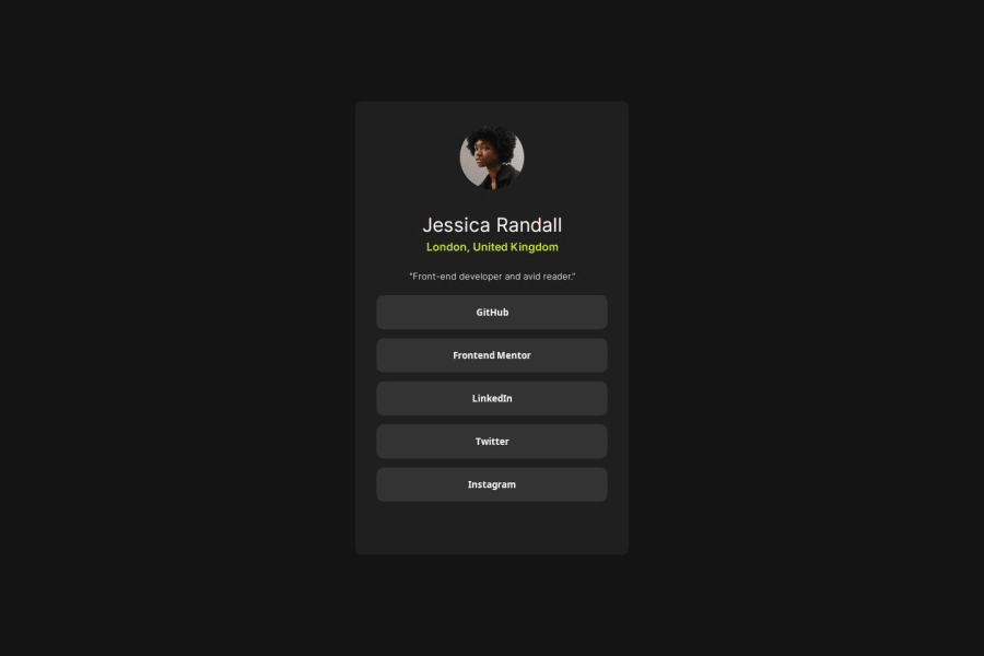


Design comparison

Community feedback
- @dvdgdPosted 7 months ago
Hello Santiago! You've done an awesome job with this preview. It looks beautiful in the desktop view.
I have some suggestions to further improve its responsiveness:
- If you give an element a fixed height, it could cause the children elements to overflow that height. You can observe this if you preview the site using the iPhone SE and the Galaxy Fold in the dev tools of your browser. This could be fixed by removing the height of 60% and adding relative padding to your card:
.card { padding: 1.5rem; margin: 1rem; /* This ensures your card will not occupy the full width of the screen */ max-width: 370px; /* With this, your card contents will not overflow a 370px width */ width: 100%; /* Ensures your card always fills the available width, in this case, 370px. Feel free to adjust this value */ }- In your avatar, the height isn't necessary either. You could set a fixed width and height like
100px. Also, the margin isn't required because you have a flex set toalign-items: centerin your card:
.avatar { width: 100px; height: 100px; border-radius: 50%; }-
You'll notice your
h1isn't center aligned. You could fix this by settingtext-align: center;. -
For your buttons, you don't need to have padding. Instead, you can set the
section-buttonsto have awidth: 100%and the buttons too. This will fit all available horizontal space in the card and maintain the spacing because of the card spacing:
.section-buttons { display: flex; gap: 13px; flex-direction: column; flex-wrap: wrap; justify-content: center; margin: 15px 0px; width: 100%; /* Set the section to occupy all available space */ } button { background-color: hsl(0, 0%, 20%); font-weight: 700; color: hsl(0, 0%, 100%); border-radius: 10px; cursor: pointer; border: none; width: 100%; /* Ensure the button occupies all available width */ height: 2.5rem; }- You can now remove all the media queries and see the magic working!
Tip for semantic HTML: Prefer to use anchor tags when referring to other pages or anything related to the user's navigation, and buttons to perform actions such as submitting a form, opening a sidebar panel, or clicking a like button on a page. I found this great answer about it When should I use a button - Stack Overflow.
I hope you find this helpful, and feel free to ask anything related. Above all, your solution is great! Happy coding!
1


Please log in to post a comment
Log in with GitHub
Join our Discord community
Join thousands of Frontend Mentor community members taking the challenges, sharing resources, helping each other, and chatting about all things front-end!
Join our Discord