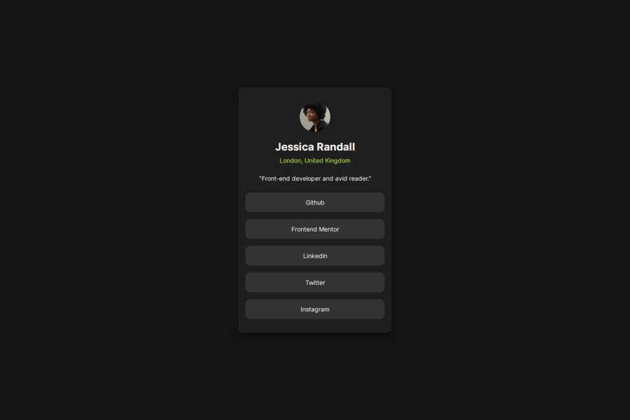
Design comparison
Community feedback
- @solvmanPosted 10 months ago
Very well done! 🎊🎉🚀
Remember, heading levels represent levels of heading subsections, not typographical decoration. The best-fitting heading for the card is most likely
h2. It would be best if you did not skip sections;h1should be followed byh2and so on. In this project, you could temporarily add a visually invisibleh1element to avoid breaking hierarchy rules. You may read more about heading hierarchy in HTML - Live Standard - HeadingsVisually hidden class for the
h1.visually-hidden { position: absolute; width: 1px; height: 1px; padding: 0; margin: -1px; overflow: hidden; clip: rect(0, 0, 0, 0); white-space: nowrap; border: 0; }I love your use of semantic HTML. However, you don't need to wrap every element in a
div.You can assign CSS classes to those elements directly. Also, consider using thebuttonelement instead of thedivelement. Remember,divis a non-sematic element. Strive to use semantic elements where it is possible. It will benefit SEO and the accessibility of your project big time. Also, there is a semantic difference between thearticleandsectionelements. You can read about it in HTML5 - Live Standard - Article or Section. With that being said, you could do something like that:<body> <main> <h1 class="visually-hidden">Profile card project</h1> <article class="card"> <session class="profile"> <img src="./assets/images/avatar-jessica.jpeg" alt="avatar" class="profile__img" aria-hidden="true" /> <h2 class="profile__name">Jessica Randall</h2> <p class="profile__location">London, United Kingdom</p> <p class="profile__description"> "Front-end developer and avid reader." </p> </div> <div class="socials"> <button class="button">GitHub</button> <button class="button">Frontend Mentor</button> <button class="button">LinkedIn</button> <button class="button">Twitter</button> <button class="button">Instagram</button> </div> </div> </main> </body>Another minor tweak that adds visual attractiveness to your project is to have a bit slower transition of color on
:hover; consider addingtransitionto yourbuttonclass:button { transition: all 0.5s; }Otherwise, very well done! 🚀 Impressive! 🎉 Keep it up! 👍
Marked as helpful0@ridhofaaauziPosted 10 months ago@solvman Thank you for the excellent and very detailed advice; I truly learned a lot from it. Once again, I would like to express my gratitude for your guidance.
1
Please log in to post a comment
Log in with GitHubJoin our Discord community
Join thousands of Frontend Mentor community members taking the challenges, sharing resources, helping each other, and chatting about all things front-end!
Join our Discord
