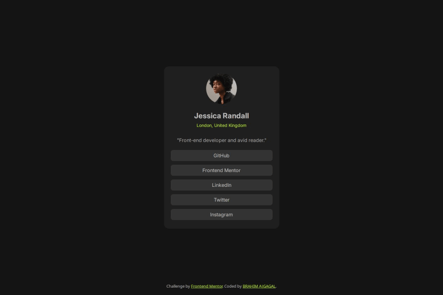
Design comparison
Solution retrospective
- being a little more accurate
- learn new things about flex
- understanding flex auto and how it affects the width and height
- boxsizing
- defaul marigns
- learn new things and avoiding confusing default values
Community feedback
- @AdrianoEscarabotePosted 27 days ago
Hey BRAHIM AJGAGAL, how’s it going? I was really impressed with your project’s result, though I have some advice that could be helpful:
Since this project is only based on a single page component, there is no need for a h1 tag. It's always a good idea to prevent accessibility errors, so I believe it would be beneficial for you to add a "h1" in this component. Don't worry if you forget about "h1," though; it's a good practice for when you are developing larger sites.
<h1>Welcome to Social links profile</h1>A document ought to have one primary landmark, and the absence of a main tag around the page's primary content is the root of this issue. On this page, there is no other element that is more important than the one that this challenge is based on, so to solve it, wrap all the content in the'main' tag.
It's always a good idea to pay close attention to the proper use of semantic html elements because they are crucial for screen reader users to understand what the main content of the page is in the case of the'main' tag!
Everything else looks great.
Hope this helps! 👍
Marked as helpful1@AslamtoIbrahimPosted 27 days ago@AdrianoEscarabote Hey Adriano, I am good 😉 Thank you so much for your feedback. I am really appreciating it. I read all your advice and I did some modefications to mo my code and I which I did what you told me.
1
Please log in to post a comment
Log in with GitHubJoin our Discord community
Join thousands of Frontend Mentor community members taking the challenges, sharing resources, helping each other, and chatting about all things front-end!
Join our Discord
