

Design comparison

Solution retrospective
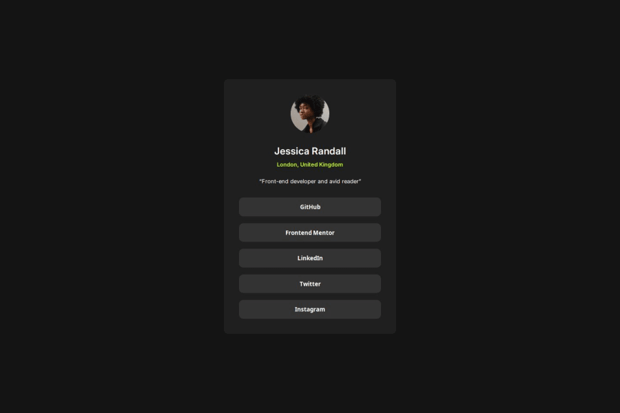
This took way less time than any of the other solutions.
I do not know if there is much to do differently. Maybe there was no need for a media query, but I like to see the edges on smaller screens, so I reduced the size of the container for smaller screens
What challenges did you encounter, and how did you overcome them?Trying to decide between using buttons or anchor tags for the social links. But then settled on using both because I figure they are supposed to link, are they not?
Also, the dimensioning of the container. I initially had two containers in the body so I would not use the body to center the container but then it became hard to manipulate the dimensions of the container
What specific areas of your project would you like help with?Any area anyone thinks can be improved. Feel free!

Join our Discord community
Join thousands of Frontend Mentor community members taking the challenges, sharing resources, helping each other, and chatting about all things front-end!
Join our Discord