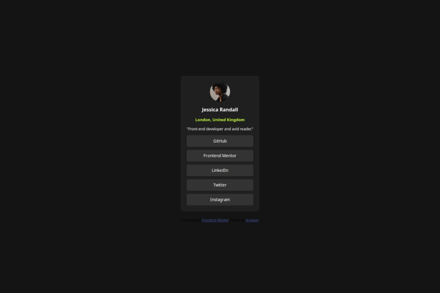
Design comparison
Solution retrospective
I am proud that I can do html and CSS very well I am looking forward to use more advanced styles and frameworks
What challenges did you encounter, and how did you overcome them?No much Challenge, just use knowledge from previous projects
Please log in to post a comment
Log in with GitHubCommunity feedback
- @rowanDeveloper
Congratulation on your project @jmuwan! Keep the good work!
I would like to give you a feedback, if you are ok with that. Looking at your code you can use a main div container as your main container. I would advice you to use more semantic HTML tags, such as <main> and <section>, so instead of a <div> and then the main code, just use <main> and then you can better structure your code:
`
<body>
	<main>
		...code

	</main>
</body>
`
Also, as for the links, because there are links and not buttons, I recommend that you use the <li> tag and then an <a> (anchor) tag. That way you can reference better the links you use. Something like:
`
 <ul class="list">
	<li class="list-item">
	  <a href="#">GitHub</a>
	</li>

	<li class="list-item">
	  <a href="#">FrontEnd Mentor</a>
	</li>

	<li class="list-item">
	  <a href="#">Linkedin</a>
	</li>
  </ul>
`
Keep the progress and feel free to ask the community or go to Discord page if you have any questions. But honestly, I like seeing your progress and I am proud of that!
Marked as helpful
Join our Discord community
Join thousands of Frontend Mentor community members taking the challenges, sharing resources, helping each other, and chatting about all things front-end!
Join our Discord
