Solution retrospective
What are you most proud of, and what would you do differently next time?
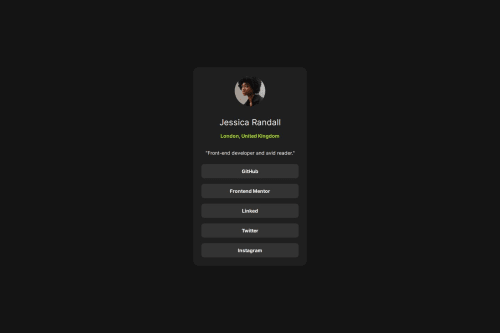
proud of the links, may try to do differently with the name, location and description parts
What challenges did you encounter, and how did you overcome them?not good at guessing the spacing between each parts
What specific areas of your project would you like help with?more accurate layout spacing specs
Code
Loading...
Please log in to post a comment
Log in with GitHubCommunity feedback
No feedback yet. Be the first to give feedback on Ivan's solution.
Join our Discord community
Join thousands of Frontend Mentor community members taking the challenges, sharing resources, helping each other, and chatting about all things front-end!
Join our Discord