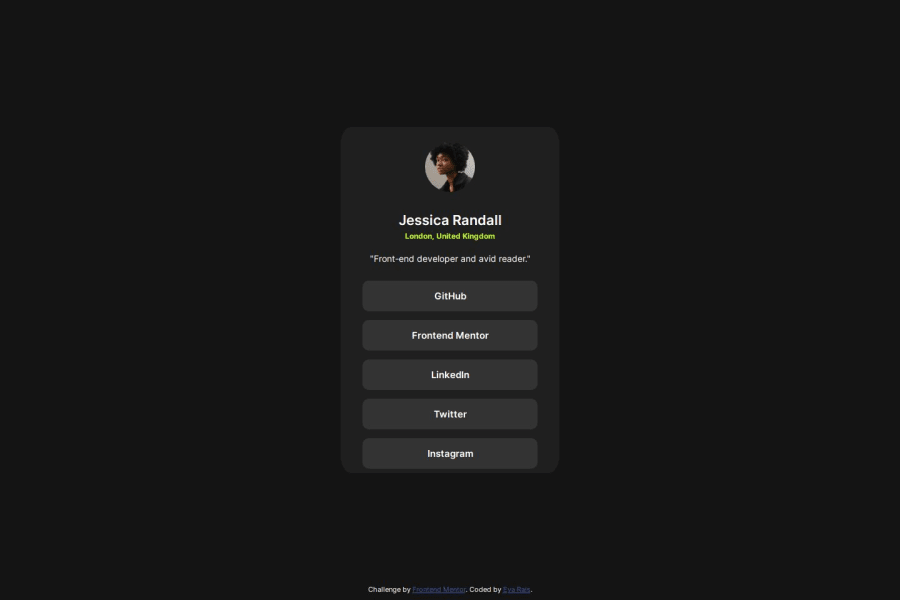
Design comparison
SolutionDesign
Community feedback
- @jaimedargalloPosted 12 months ago
Good job, the only thing I would add is some margin at the bottom and adjust some spaces. 😉
0
Please log in to post a comment
Log in with GitHubJoin our Discord community
Join thousands of Frontend Mentor community members taking the challenges, sharing resources, helping each other, and chatting about all things front-end!
Join our Discord
