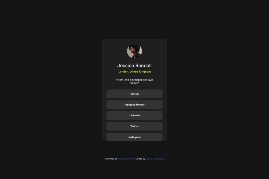
Design comparison
Solution retrospective
I'm happy with my use of flexbox. Next time, I would design something a little more complex.
What challenges did you encounter, and how did you overcome them?I took me a while to figure out how to position the attribution at the bottom of the page. I resolved this by adding a margin to the main container.
What specific areas of your project would you like help with?I feel comfortable with this project.
Community feedback
- @LaurenAMolloyPosted 6 months ago
Hi! Awesome job so far. The design is very close to the solution. The layout is suitable for mobile and desktop. The code is structured well. Something I am working on at the moment and it might help you in future projects is moving away from fixed widths and using percentages. There is a nice course by Kevin Powell that may be worth looking at.
Marked as helpful0@CamrynTidsworthPosted 6 months agoThis is really helpful, thank you! I've run into some funky issues with fixed widths and was already looking for alternatives. Do you remember the name of the course? @LaurenAMolloy
0@LaurenAMolloyPosted 6 months agoThe course is called conquering responsive layout and it is free. I am also going to refer to it to help me with the next challenge. Enjoy! @CamrynTidsworth
1
Please log in to post a comment
Log in with GitHubJoin our Discord community
Join thousands of Frontend Mentor community members taking the challenges, sharing resources, helping each other, and chatting about all things front-end!
Join our Discord
