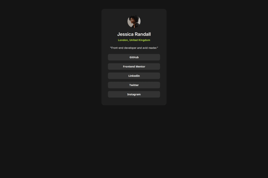


Design comparison

Community feedback
- @AdrianoEscarabotePosted about 1 month ago
Hi iliassabbad, hope you're doing well! I loved how your project turned out, but I’ve got a few suggestions that could be useful:
Using Flexbox or Grid on the
bodyto center elements ensures a more responsive and adaptive layout, fitting different screen sizes seamlessly. It avoids manual calculations and constant adjustments needed withmargin,padding, or absolute positioning. These techniques provide more consistent alignment and simplify the code.flexbox:
body {
    display: flex;
    justify-content: center;
    align-items:  center;
    min-height: 100vh;
}
grid:
body {
    display: grid;
    place-content: center;
    min-height: 100vh;
}
The rest is fantastic.
Hopefully, you'll find it helpful. 👍
0@iliassabbadPosted about 1 month ago@AdrianoEscarabote Thank you so much for the suggestions
1 - @stephany247Posted about 1 month ago
You're doing a fantastic job! It's clear you’ve put a lot of thought and effort into this project. I love how it's coming together, and with just a few tweaks, it could shine even brighter. Here are a few small improvements that could help elevate your work even more.
-
One important thing to note is that you should delete the initial README.md file and customize the template README to reflect the specifics of your project before pushing it to GitHub.
-
It’s a good practice to use more meaningful tags like
<header>,<section>or<article>instead of generic<div>tags. This will improve the document structure and make it more readable for both developers and assistive technologies (screen readers). -
Instead of plain buttons, it would be more semantic to use
<a>elements for the social links, as these represent navigation. Additionally, provide aria-labels to make the buttons more descriptive for screen readers. For instance:<a href="#" class="profile-button" aria-label="GitHub Profile">GitHub</a> -
In your
ptag styles, you set the font size to14px. It’s better to use relative units likeremorem, which will respect the user's font settings and improve accessibility. Example:p {font-size: 0.875rem; /* equivalent to 14px */} -
Instead of using
pxfor dimensions like width and height, useremoremunits. These are more scalable and adapt better to user settings for accessibility (e.g., font scaling).
I hope these suggestions are helpful in refining your project even further! You're making incredible progress. Keep up the amazing work—you're on the right track, and I can't wait to see what you create next! Stay motivated and keep coding with passion.
0 -


Please log in to post a comment
Log in with GitHubJoin our Discord community
Join thousands of Frontend Mentor community members taking the challenges, sharing resources, helping each other, and chatting about all things front-end!
Join our Discord