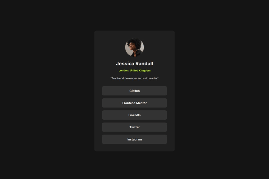


Design comparison
SolutionDesign

Solution retrospective
What are you most proud of, and what would you do differently next time?
I would use a ul in the buttons so i couuld do a smooth mouse transition
What challenges did you encounter, and how did you overcome them?i wanted to do an effect when u put the mouse on the buttons, so i got to learn it
What specific areas of your project would you like help with?I would like some help in css structure and tags i used
Community feedback
- @BlackpachamamePosted about 1 month ago
Greetings! you have done a great job 😎
📌 Some suggestions
- Add a
paddingto generate interior space on your card. This prevents you from usingmarginorpaddingon child elements to achieve the same result - I recommend doing a small
resetto the styles that come by default in the browsers. To do this, you can apply a couple of properties to the universal selector*, with this you will make your site look the same in all browsers - I leave you the task of researching the
reset CSSand thebox-sizing: border-box - If you didn't apply the reset, you can add
margin: 0to yourbody, this will remove annoying scrolling on large screens. If you want to maintain separation on very small screens, you can apply themarginagain using media querys
0 - Add a
- @wesleybalbPosted about 1 month ago
You could use some hoover in the butons to have a better effect. I liked how you use this effect in links.
0


Please log in to post a comment
Log in with GitHubJoin our Discord community
Join thousands of Frontend Mentor community members taking the challenges, sharing resources, helping each other, and chatting about all things front-end!
Join our Discord