Design comparison
Solution retrospective
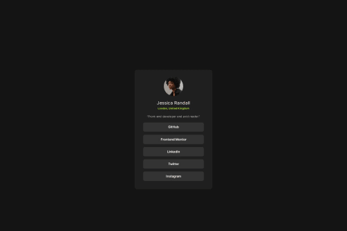
hello! This was my first time trying to use rem and also media queries so i would really appreciate any feedback about that or anything else you guys think i should look into next time :)
Community feedback
- @MikDra1Posted 3 months ago
-
Consolidating Font-Face Declarations: Combine all @font-face rules into one using multiple font-weight values to reduce repetition.
-
Creating Reusable Classes: Extract common properties like margins, letter-spacing, and font sizes into reusable CSS classes.
-
Using CSS Variables: Define colors, font sizes, and spacing as CSS variables for consistency and easier maintenance.
-
Optimizing Media Queries: Use fluid typography with clamp() and simplify breakpoints to enhance responsiveness.
-
Improving Layout: Consider using Flexbox or a full CSS Grid approach in the body for more reliable cross-browser layout behavior.
Marked as helpful0@YaniChavesPosted 3 months ago@MikDra1 thank you so much for all the tips! I will consider them in my next challenge :)
0 -
- @neena-coderPosted 3 months ago
So instead out commenting out your attribute section, why not copy your profile link and replace with the href attribute. This section below... Good job overall
<!--<div class="attribution"> Challenge by <a href="https://www.frontendmentor.io?ref=challenge" target="_blank">Frontend Mentor</a>. Coded by <a href="#">Your Name Here</a>. </div>-->0
Please log in to post a comment
Log in with GitHubJoin our Discord community
Join thousands of Frontend Mentor community members taking the challenges, sharing resources, helping each other, and chatting about all things front-end!
Join our Discord