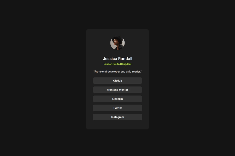
Design comparison
Solution retrospective
Im very proud about how close the solution looked liked to the real one even thought I didn't use a figma file. One thing I would do differently would be to name my classes better.
What challenges did you encounter, and how did you overcome them?The challenges I encountered were that the links kind of looked off in the padding, I overcame them by trying different solutions intill I found a padding that worked.
What specific areas of your project would you like help with?I dont know specificly but any feedback would be fine.
Community feedback
- @DylandeBruijnPosted 9 months ago
Hi @Masseh2025,
Congratulations on a great solution, it looks very good! You have an eye for design. Good use of CSS variables and relative CSS units like rem.
A bit of friendly constructive feedback:
-
You could try using more semantic tags like a
h1tag instead of adivfor the author's name. This helps screen reader users to navigate your page. -
Instead of
border-radius: 1000pxyou could useborder-radius: 50%to turn your image in a circle. -
I would suggest putting your
atags in thelitags in the list to keep the structure intact.
I hope you find my feedback helpful and if you have any other questions let me know!
Marked as helpful1 -
Please log in to post a comment
Log in with GitHubJoin our Discord community
Join thousands of Frontend Mentor community members taking the challenges, sharing resources, helping each other, and chatting about all things front-end!
Join our Discord
