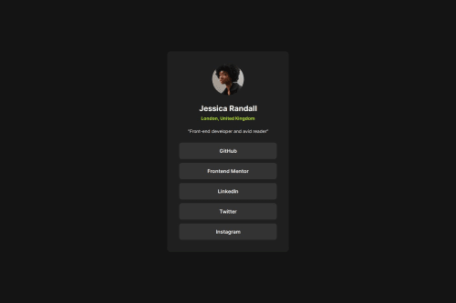
Submitted over 1 year agoA solution to the Social links profile challenge
social-links-profile
@mariokreitz

Solution retrospective
What are you most proud of, and what would you do differently next time?
I did not use the Figma file :D
What challenges did you encounter, and how did you overcome them?The spacing. I tried to eyeball the settings :D
The aria and role attributes are kinda difficult for me and still got no clue the propper use of it (I need to watch the docs / vids)
Code
Loading...
Please log in to post a comment
Log in with GitHubCommunity feedback
No feedback yet. Be the first to give feedback on Mario Kreitz's solution.
Join our Discord community
Join thousands of Frontend Mentor community members taking the challenges, sharing resources, helping each other, and chatting about all things front-end!
Join our Discord