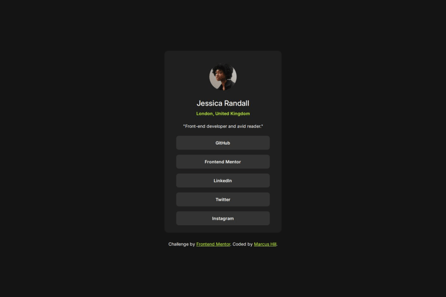
Design comparison
Solution retrospective
The overall design and the use of figma in order to perfectly calculate the sizes for padding, divs and margins. I also used media queries to make it responsive for tablets, desktops and mobiles (as per the figma design files).
What challenges did you encounter, and how did you overcome them?I encountered problems initially trying to make it responsive for mobile and desktop without the use of media queries. However, once I added media queries I was able to use the Chrome Developer tools to assist me in resizing them with the use of rems.
What specific areas of your project would you like help with?I would like help with my use of media queries. I am not sure if this is the best way to do it in order to follow best practices of responsive websites and whether pixels are the best units to do this.
Community feedback
- @grace-snowPosted about 1 month ago
This looks pretty good but is hitting my screen edges on all sides which shouldn't happen.
To be honest, I think there are some bad practices creeping in on this which you should correct. I'll try to list the things I noticed but some are just opinion / recommendations.
- all content should be contained within landmarks. The attribution should be inside a footer.
- the image in this is decorative in my opinion. That alt description isn't adding any meaningful content.
- it would be good for the list of links to be in an actual list.
- when links open in a new tab that is unexpected behaviour that should be communicated to people using a screen reader. You can do that with some sr-only text in a span inside the link (best) or using the title attribute (OK). For example "(opens in a new tab)".
- it's better for performance to only load one stylesheet instead of calling the reset and main styles separately. Just put the reset styles at the start of your css.
- it's better for performance to link fonts in the html head instead of css imports.
- html head order can really affect performance later when you get to big projects. Move the title higher up so it's straight after the meta tags.
- ⚠️ Never set the font size on the html element. That makes it so peoples font size preferences in their browser or device will no longer work. Its changing what 1rem means and that also is terrible for working with other developers and can lead to unexpected consequences all over a site. Just never ever do it. Always use rem for font size. You can put this on yhe body or other elements, just not html. (As a general rule dont put any styles on the html)
- the card shouldnt have a min-width on it. You can make it width 100% as well as the rem max width if you want it to fill the space up until the max limit you've set.
- the card doesn't need and shouldn't have a min-height. Let it be as tall as it needs to be based off the content.
- ⚠️ Beware nesting selectors unnecessarily. This increases css specificity for no reason and can make the styles very hard to manage and maintain on larger projects. Stick to single class selectors as much as possible. Place classes directly on what you want to style.
- the card should have padding and cards be full width / display block
- there's no benefit to making the social links block a flex column unless you're using gap for the vertical spacing (and then using grid would be shorter css).
- the quote in the design can be done with the <q> element I think, so you shouldn't need any pseudos.
- ⚠️ there's no need for any media queries in this so you can remove them all. Even if you did need media queries this wouldn't be how you write/use them. As we style mobile first (almost always) the mobile styles are the default. You only need to use min-width media queries most of the time to change some properties for larger screens. And defining those media queries in rem or em not px means the layouts will adjust at good times for users with different font size settings too. I've written about media queries on my FEDmentor.dev site if you want to take a look.
Marked as helpful0@marcus-hillPosted about 1 month agoHi @grace-snow,
Thanks so much for taking the time to review my solution on this. It's given me a much better understanding of responsive design and working to view the elements in the dev tools to understand how they inherit from their parents and take up the available space.
I've made lots of changes to the code and this will definitely help me moving forward.
0 - @gozicaPosted about 1 month ago
The solution includes semantic HTML and is mostly accessible, though I could enhance it with better color contrast and alt text. The layout is responsive, the code is well-structured and reusable, and it closely matches the original design.
0
Please log in to post a comment
Log in with GitHubJoin our Discord community
Join thousands of Frontend Mentor community members taking the challenges, sharing resources, helping each other, and chatting about all things front-end!
Join our Discord