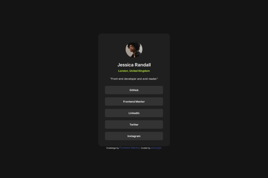


Design comparison

Solution retrospective
This was my first project without a figma file, but I think I managed to copy the design quite well even without it.
What challenges did you encounter, and how did you overcome them?Setting the right margins in a display: flex was an issue for me, also sizing the buttons correctly. I tried to just use the gap property but it didn't really work, so I just eyeballed the margin on the different list items.
What specific areas of your project would you like help with?I want to know how to size the buttons without hardcoding them. In my solution I assigned a set value to the padding of the buttons, instead I want to know if I can just "stretch them" without assigning values.
Please log in to post a comment
Log in with GitHubCommunity feedback
- @Alex-Archer-I
Hi again!
Hey, the list of links here is perfect example when you can use
flex-gapinstead of margins. You need to apply it to theulelement..socials { gap: 1.2em; }The pros is these gaps will be only between the links, meanwhile
margin-toppushed first element from the top.Well, padding is one convenient ways to 'stretch' the elements especially inline ones. You can try to use percentage values, but I not recommend you cos percentage of paddings and margins depends of the width of the parent element and therefore could be a bit unpredictable. There is no harm to hardcode a little =)
Your work is really improved, by the by =) Good luck =)
Marked as helpful - @Ayomi-Rahmat
Improvements? I don't think so. It is a responsive website.


Join our Discord community
Join thousands of Frontend Mentor community members taking the challenges, sharing resources, helping each other, and chatting about all things front-end!
Join our Discord