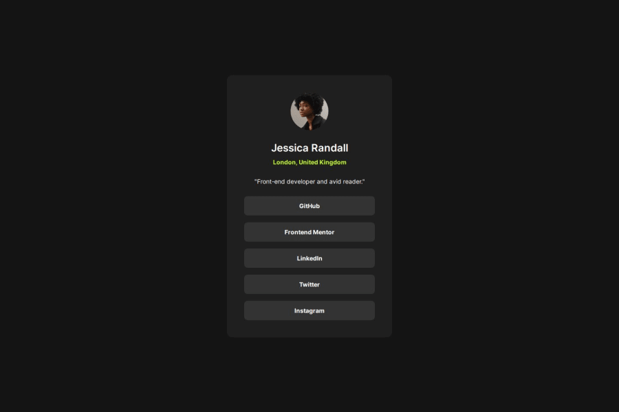
Design comparison
Solution retrospective
I didn't take too long to complete this!
What challenges did you encounter, and how did you overcome them?The width of the card isn't accurate
What specific areas of your project would you like help with?Any general advice is appreciated
Community feedback
- @danielmrz-devPosted 8 months ago
Hello @mhykah-webdev!
Your solution looks great!
📌 It's recommended to use semantic HTML elements like
<ul>and<li>for creating lists. This ensures that your code is more accessible, maintainable, and semantically meaningful.Here's and example on how you can refactor your code:
Instead of using
<div>and<button>use this:<ul class="list-container"> <li><a href="#">Github</a></li> <li><a href="#">Frontend Mentor</a></li> <li><a href="#">LinkedIn</a></li> ... </ul>By using
<ul>and<li>, you convey the structure of your content more clearly, making it easier for screen readers and search engines to understand. Additionally, it aligns with best practices for HTML semantics.I hope you find this helpful!
Keep up the excellent work!
0
Please log in to post a comment
Log in with GitHubJoin our Discord community
Join thousands of Frontend Mentor community members taking the challenges, sharing resources, helping each other, and chatting about all things front-end!
Join our Discord
