


@DanCodeCraft
Posted
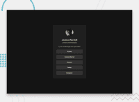
Hey @sercanvr, good job on this one!
Design-wise: Looks good, and similar to the original. It's a tad out of proportion in terms of height, making the text squeeze a bit into two lines, and also making the buttons shorter on the sides. You nailed it when comes to spacing!
Code-wise: You should consider using your font size in rem, not in px. This can affect the accessibility of your sites greatly. I see you used an ID for the avatar part when it could be just a class. IDs are for very specific elements within your website. The same goes for the media query. Since this project is short and designed vertically, a good approach would be a mobile-first instead. This would eliminate the need for media queries.
As a piece of advice: The head order matters for bigger projects. Research about it, make a habit, and avoid issues in the future. The same goes for CSS reset: try finding a more modern style for it (recommended: https://piccalil.li/blog/a-more-modern-css-reset/)
Keep up the good work!
