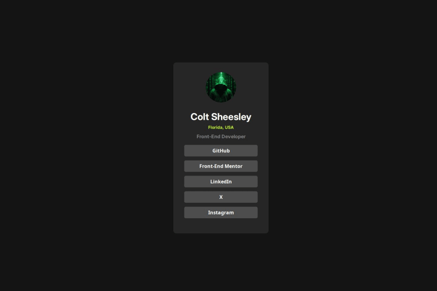
Design comparison
Solution retrospective
I'm finally getting the hang of CSS and styling elements for pragmatically. It was fun to learn how to use the flex box model to center the profile card and making sure everything matches the style of the design as close as possible. Plus, making something that I actually showcase my personal expertise and socials was something that I never thought I would be able to do until now.
What challenges did you encounter, and how did you overcome them?I had some struggles with the styling and the CSS, especially with working out the padding and margins to get the spacing right on the links and the card. I managed to get it right through trial-and-error, but I would love to know if there is a more efficient way to get this right.
What specific areas of your project would you like help with?I feel like I managed to get this project right with minimal help, but I would love feedback as to what could be done better.
Community feedback
- @tOnski86Posted 5 months ago
I hope this is a joke because this looks close to the original!
I just reviewed your code and here are my thoughts:
I see that you have started using
remfor some of your units. This is a great start for you to get really fluid designs. However, I was kinda wondering why you did not apply the same process for your container widths (you still used px).My suggestion here is to really understand what your
remsize is. By default (I think) it's 16px. There is a trick to make it easier for you to think inrem- It's hard to calculate1rem = 16px, 2rem = 32pxand so on. So you might want to define:html { font-size: 62.5% }What this does
This makes so that every time you use 1rem anywhere on your project, it now refers not to
16px, but10px! So1rem = 10px, 2rem = 20pxand so on. Easier right?Other suggestions
- In general, start with the overall layout when designing your element. As much as possible, start with the bigger designs, such as the card - and set the overall padding and margins of the element.
- When moving to smaller components, such as the buttons, look for commonalities. For instance, the vertical spacing is equal among all the buttons - except for the last one. I would probably implement something like this:
.your-list-selector:not(:last-child) {
  margin-bottom: value
}
This way, you are maintaining the integrity of your card styles without having to worry about how the smaller elements interfere with it.
Hope these small suggestions make sense. If anything, feel free to reach out. Great job and keep going!
Marked as helpful1@Xerver8694Posted 5 months ago@tOnski86 Thanks so much for the input. I'm still getting used to using the rem instead of the px for CSS, so I guess I missed that one piece that you mentioned. This will definitely be helpful for my future projects. I seriously owe you one!
1@tOnski86Posted 5 months ago@Xerver8694 the trick I showed can be useful anywhere once you have the size of your
remdefined.Hope you have fun!
Marked as helpful1 - @kira7777Posted 5 months ago
Structure and Readability: Ensure the code is well-structured and easy to read, with consistent indentation and meaningful variable names.
Modularity: Check if the code is modular, with reusable components and functions.
Comments: Look for comments that explain complex logic or provide context for certain decisions.
0
Please log in to post a comment
Log in with GitHubJoin our Discord community
Join thousands of Frontend Mentor community members taking the challenges, sharing resources, helping each other, and chatting about all things front-end!
Join our Discord
