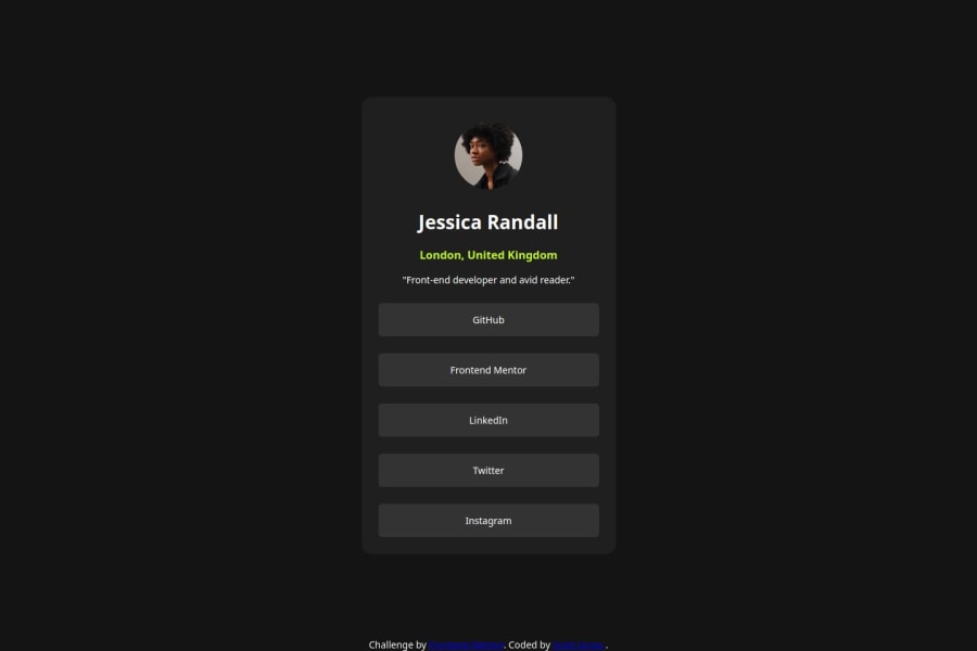
Design comparison
Solution retrospective
I am most proud of how I managed to effectively utilize max-height and min-height properties to create a responsive and visually appealing blog preview card. Learning how to handle margins, padding, and alignment better has significantly improved the overall layout and design of the project. Additionally, I’m pleased with my progress in mastering pixel usage, borders, and hover techniques, which added a polished touch to the final design.
Looking ahead, I would focus on determining the exact dimensions of the card more precisely to ensure a more consistent and professional look. I plan to delve deeper into techniques for measuring and designing components accurately. Continuing to refine my skills in HTML and CSS will also be a priority to enhance the quality and responsiveness of future projects.
What challenges did you encounter, and how did you overcome them?One of the main challenges I encountered was managing the layout and dimensions of the card to ensure it was both responsive and visually balanced. I struggled with using max-height and min-height effectively to achieve the desired layout without causing overflow or misalignment issues.
To overcome this, I focused on understanding how these properties interact with other CSS features such as margins and padding. I utilized various CSS debugging tools to visually inspect and adjust the layout. By experimenting with different values and combinations, I was able to refine the card's dimensions and alignment.
Another challenge was perfecting the hover effects and ensuring they worked consistently across different screen sizes and browsers. I addressed this by thoroughly testing the hover states and making adjustments as needed to ensure a smooth and interactive user experience.
These experiences taught me valuable lessons in CSS layout techniques and responsive design, which will be beneficial in future projects.
What specific areas of your project would you like help with?I would appreciate help with the following areas:
Precision in Dimensions: I want to improve my skills in accurately determining and setting the exact dimensions of the card. Guidance on techniques for measuring and adjusting component sizes more precisely would be valuable.

Advanced CSS Techniques: While I’ve made progress with basic CSS properties, I’m interested in learning more advanced CSS techniques and best practices, particularly in areas like CSS Grid and advanced Flexbox layouts.

Responsive Design: Although I used a mobile-first approach, I’d like to deepen my understanding of responsive design principles to ensure that all elements of the card adapt seamlessly across various screen sizes and devices.

Cross-Browser Consistency: Ensuring that the card looks and functions consistently across different browsers is an area where I’d like to get more expertise. Tips on effective cross-browser testing and fixing compatibility issues would be helpful.
Please log in to post a comment
Log in with GitHubCommunity feedback
- @Accel-exe
'-'
Join our Discord community
Join thousands of Frontend Mentor community members taking the challenges, sharing resources, helping each other, and chatting about all things front-end!
Join our Discord
