Not Found
Not Found
Not Found
Not Found
Not Found
Not Found
Not Found
Not Found
Not Found
Not Found
Not Found
Not Found
Not Found
Not Found
Not Found
Not Found
Not Found
Not Found
Not Found
Not Found

Submitted

Social Links Profile

@PatricioZarauz

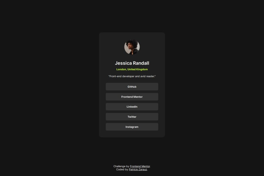
Desktop design screenshot for the Social links profile coding challenge

This is a solution for...

  • HTML
  • CSS
1newbie
View challenge

Design comparison


SolutionDesign

Solution retrospective


What are you most proud of, and what would you do differently next time?

I'm most proud of creating the animations on hover and active states of the buttons, which look cool.

What challenges did you encounter, and how did you overcome them?

I countered 2 main challenges, the first one was regarding the max-width of the card, which it didn't behave as I expected with the margin, this was fixed by using box-sizing attribute. The second challenge that I faced was regarding the animations with the buttons. Which I solved by watching some youtube videos

What specific areas of your project would you like help with?

I'm open to feed back regarding the animations as well any code improvements with the simplification of the HTML structure or css.

Community feedback

Tharun Raj 1,250

@Code-Beaker

Posted

Hi there, congratulations on completing this challenge... You're doing a great job! 🎉

I visited your website and you've done an interesting work making the website. It looks close to the design and you've added your layer of creativity to make it look and feel better! Let me share some of my suggestions regarding your solution that might help you improve it:

  • Create variables for properties that you will use multiple times. You've done this for colours. But, this can also be done to the font-weights and font-sizes. Using maps will be a lot efficient when having multiple variables of the same type(eg: set of colors, set of font sizes, etc.). Here is an article that covers SCSS Maps and how to use them
  • Add more class names to your elements. Using class names is a much better way to style your page rather than using the element/tag selectors. This is especially handy when working on large projects.
  • Putting a small vertical gap between that card and the footer might make it look better.
  • NEVER set font-size in pixels. Here's why

Overall, you've done a great work. There is still space for improvement and I'm sure you will be able to create better and more accessible projects!

Hope this helps you... 😄

Marked as helpful

1

Please log in to post a comment

Log in with GitHub
Discord logo

Join our Discord community

Join thousands of Frontend Mentor community members taking the challenges, sharing resources, helping each other, and chatting about all things front-end!

Join our Discord