Design comparison
SolutionDesign
Please log in to post a comment
Log in with GitHubCommunity feedback
- @mbalali63
Hi ivara
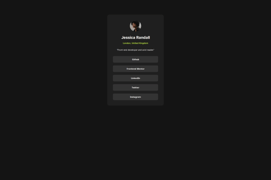
Your design looks perfect. but as I checked your code, it seems that the mobile and desktop dims are the same. but in the design the desktop is a bit larger. Also the dimensions of your design are much smaller than the target. You know these are really unimportant considerations and the most important fact is that your design looks great. thank you.
Marked as helpful
Join our Discord community
Join thousands of Frontend Mentor community members taking the challenges, sharing resources, helping each other, and chatting about all things front-end!
Join our Discord
