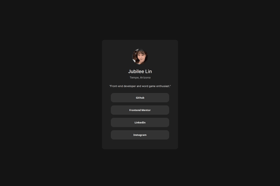


Design comparison

Solution retrospective
I tried to apply some knowledge that I learned from the last challenge about using different CSS units in order to create responsive designs and apply it to this design, such as using rem instead of px.
What challenges did you encounter, and how did you overcome them?It was difficult getting used to rem, but I did realize how much more effective it is at creating responsive web design.
What specific areas of your project would you like help with?I want to know if I used rem correctly, I kinda just replaced all instances of px with rem and used a media query to resize the container on a mobile phone screen. I also would like to try and use mobile-first workflow on the next project I do, so if anyone has advice or tips about this concept, it would be appreciated.
Community feedback
Please log in to post a comment
Log in with GitHub
Join our Discord community
Join thousands of Frontend Mentor community members taking the challenges, sharing resources, helping each other, and chatting about all things front-end!
Join our Discord