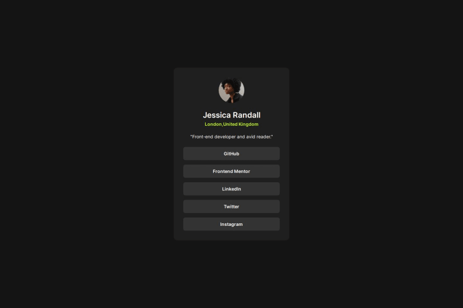
Design comparison
Solution retrospective
I am so much proud that day by day my skills are improving.
What challenges did you encounter, and how did you overcome them?nothing big challenge I got in this project.
What specific areas of your project would you like help with?some of the difficult layouts structure.
Community feedback
- @xNyfPtxPosted 7 months ago
Recently finished reading your code, its good but has few issues.
-
Your html needs a landmark (preferably the main element) for better accesibility and semantic HTML. All websites should have 1 main landmark atleast aswell. Replace .card with a main tag instead of a div following this advice
-
Remove the .container div and instead apply the styles on the body element itself
-
Use fallback fonts in your CSS. You've set the body element with a font-family of Inter but it doesnt have fallback. Typically, fallback fonts are usually sans-serif most of the time. Fallback fonts are helpful when your users have low bandwidth or are either unable to load the font you are using
-
Never set font-sizes in rem. See why
-
Use the rem unit in place of px most of the time. You would use typicall px for very small stuff such as borders, outlines, shadows and the like. You would use rem for stuff that you want to scale with users font size such as widths, paddings, margins and everything else. Most of the time, you would use rem instead of px really.
-
Don't set a width not 100% Just use a max-width paired with
width: 100%most of the time. If I seewidth: 90%on an element, I ask "Is this too large, too small or what". You would typically use width in percentage units other than 100% in multiple cards with flex container that need to have the same width or stuff like that which isn't the case here. -
Take a look at a naming methodology such as BEM and see it if helps you write more maintanable CSS and write HTML classes more easily
-
Use a CSS reset What it does is that it makes your CSS ignore all of the browser defaults therefore making your CSS more consistent across devices. You don't really have to learn anything since you just copy and paste it inside your code. I reccomend using Andy Bell's or Josh Comeau's CSS reset as most people use them
-
Learn to differ when to use paddings vs margins. For example, your .link element has both margins and paddings which is not the right way to approach this. You should remove the paddings and margins in the .link element and instead use padding on your list element
-
Keep CSS specificity as low as possible. For example,
ul li .linkuses descendant selectors which increases your speficity therefore making it harder to override your CSS later. Even "oh i won't override this thing later", you will forget that CSS later and other people in your team will likely overrride it too
With that said, refactor your CSS and HTML with the following advice. It might seem overwhelming but treat it as a todo list and do one at a time.
Have a nice day and don't forget to have fun coding!
Marked as helpful2 -
Please log in to post a comment
Log in with GitHubJoin our Discord community
Join thousands of Frontend Mentor community members taking the challenges, sharing resources, helping each other, and chatting about all things front-end!
Join our Discord
