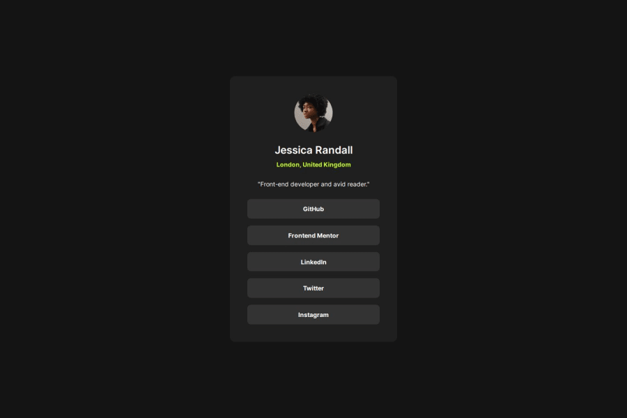
Design comparison
Solution retrospective
A relatively straight-forward challenge, but still had some interesting problems, like making sure the button elements are displayed at full-width.
Also tried a new approach to get as much fine-grained control over the clamp() function as possible.
Community feedback
- @dnksebastianPosted 10 months ago
Hi Rob,
good job on finishing the project! One minor thing which I've noticed is that instead of using a div which wraps the buttons, you might want to change it into an unordered list with anchor tags to make the code more semantic. Using <a> instead of <button> in this case sounds like a better choice because we can assume that social media links have their href attributes, buttons on the other hand should generally be used for JS interactivity :)
Here's a condensed article covering the issue: https://css-tricks.com/a-complete-guide-to-links-and-buttons/
Hope that helps!
Marked as helpful1@robmeijerPosted 10 months ago@dnksebastian Hi Sebastian, thank you so much for the feedback! I went back and forth between using buttons and links, and as the links don't really go anywhere, I decided on buttons instead.
But your reasoning makes sense, and the article you linked is very useful.
I am going to update it to have as a good example.
Thanks again!
1@dnksebastianPosted 10 months ago@robmeijer For empty or placeholder links you can use href="#/" so that your page doesn't reload or jump to the top after clicking the link :)
Marked as helpful1
Please log in to post a comment
Log in with GitHubJoin our Discord community
Join thousands of Frontend Mentor community members taking the challenges, sharing resources, helping each other, and chatting about all things front-end!
Join our Discord
