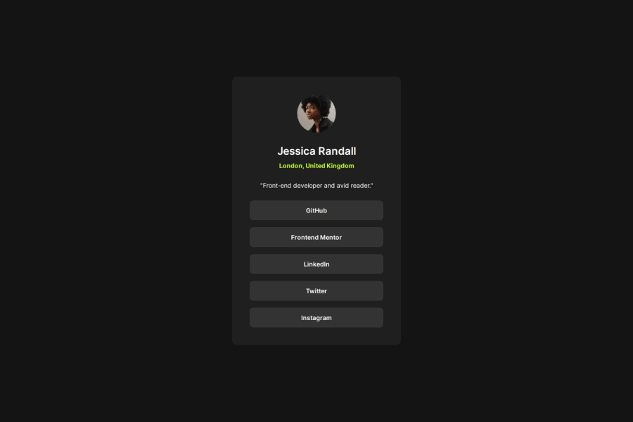
Design comparison
SolutionDesign
Solution retrospective
What are you most proud of, and what would you do differently next time?
I'm proud it didn't take much time to do this one. I code faster with every single challenge. Also I am better and better with reading infos from figma files.
What challenges did you encounter, and how did you overcome them?The main problem and challenge for me is to motivate myself to do systematic work. I need to do it on consistant basis not only from time to time.
What specific areas of your project would you like help with?I don't know what can I do better in this one.
Community feedback
Please log in to post a comment
Log in with GitHubJoin our Discord community
Join thousands of Frontend Mentor community members taking the challenges, sharing resources, helping each other, and chatting about all things front-end!
Join our Discord
