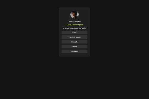
Submitted over 1 year agoA solution to the Social links profile challenge
Social Links Profile
@JesyQueck

Solution retrospective
What challenges did you encounter, and how did you overcome them?
I suffered a bit in styling the buttons since I didn't use the button tag. I had to solve separately
Code
Loading...
Please log in to post a comment
Log in with GitHubCommunity feedback
No feedback yet. Be the first to give feedback on JesyQueck's solution.
Join our Discord community
Join thousands of Frontend Mentor community members taking the challenges, sharing resources, helping each other, and chatting about all things front-end!
Join our Discord