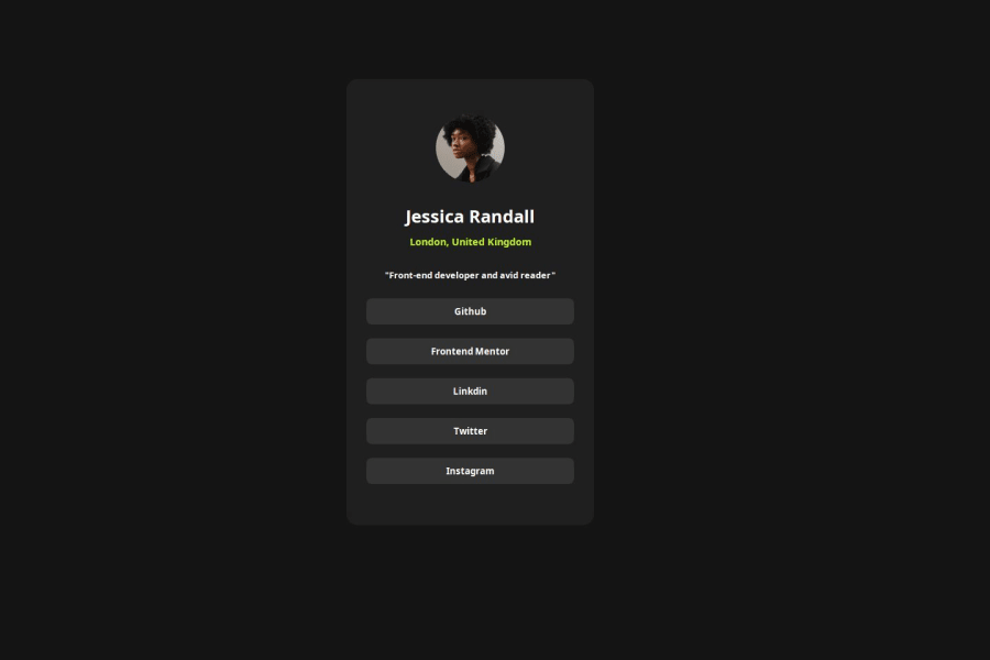
Design comparison
Solution retrospective
I'm most proud of how clean and organized the code is in this example. Each element is properly structured and styled, making it easy to understand and maintain. Additionally, the use of CSS for styling allows for flexibility and consistency across different devices and screen sizes.
If I were to do something differently next time, I might consider adding more interactivity or animations to make the social links profile more engaging. This could include hover effects, transitions, or even interactive elements like buttons or tooltips. Additionally, I might explore using CSS frameworks like Bootstrap to streamline the development process and ensure better compatibility across browsers.
What challenges did you encounter, and how did you overcome them?The main challenge was ensuring consistent display across browsers and devices. I used modern CSS techniques like flexbox and media queries for responsiveness. Ensuring smooth hover effects across browsers was another challenge, addressed with CSS transitions and thorough testing.
What specific areas of your project would you like help with?none
Community feedback
Please log in to post a comment
Log in with GitHubJoin our Discord community
Join thousands of Frontend Mentor community members taking the challenges, sharing resources, helping each other, and chatting about all things front-end!
Join our Discord
