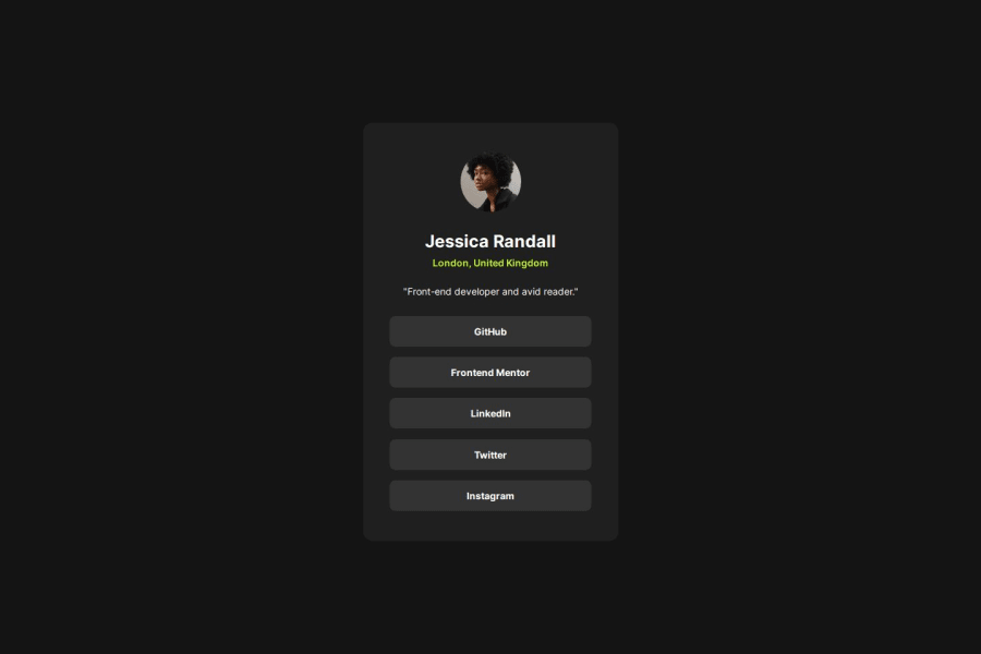
Design comparison
SolutionDesign
Community feedback
- @neildeoPosted 12 months ago
Really nice job Martin. Particularly like your CSS reset, I'll be stealing it for myself! The organisation of the CSS is also great.
The only improvement I can think of is to make your .container div a main element, to improve the semantics of the page.
0
Please log in to post a comment
Log in with GitHubJoin our Discord community
Join thousands of Frontend Mentor community members taking the challenges, sharing resources, helping each other, and chatting about all things front-end!
Join our Discord
