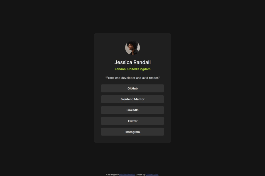
Design comparison
SolutionDesign
Solution retrospective
What are you most proud of, and what would you do differently next time?
I'm proud that I found this challenge simple and was able to finish it fairly quickly. I feel like I'm getting the hang of the workflow and setting up Git and GitHub for my projects.
What challenges did you encounter, and how did you overcome them?I didn't really encounter any challenges this time. But, as always, please let me know if you see anything I could improve on!
What specific areas of your project would you like help with?help:
- I thought that Bootstrap would help me with this challenge, but I ended up not really using it that much. I used a few classes for the buttons, but, ultimately, I felt like I could've done without. I'm wondering how I could have utilized Bootstrap more in this challenge? Or, is Bootstrap really not necessary in this case?
- I attempted a mobile-first approach for this challenge, shrinking the size of the viewport down and working from there, but I didn't really notice a difference in terms of my process... perhaps I did it wrong? Please let me know if you notice anything I could improve on in regards to the mobile-first approach!
Community feedback
Please log in to post a comment
Log in with GitHubJoin our Discord community
Join thousands of Frontend Mentor community members taking the challenges, sharing resources, helping each other, and chatting about all things front-end!
Join our Discord
