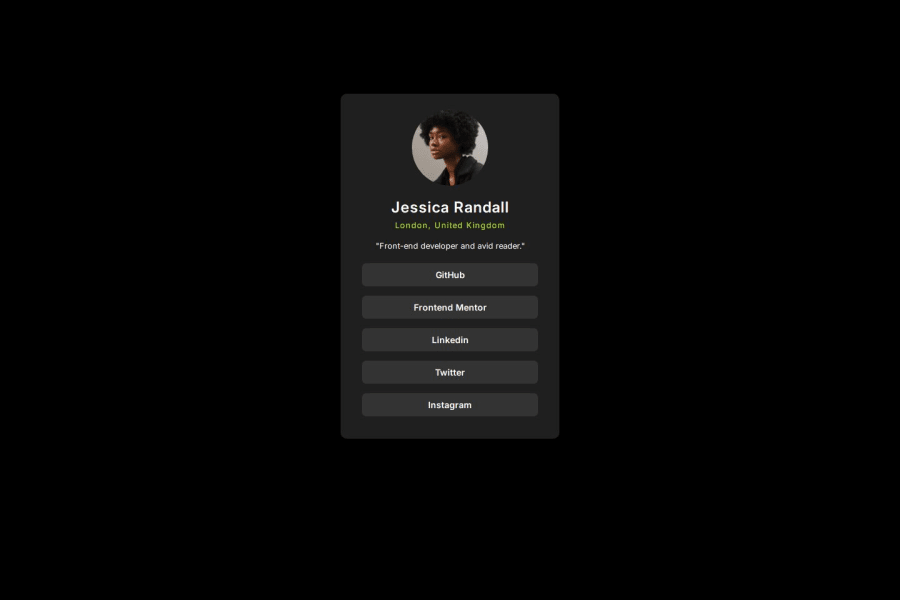
Design comparison
SolutionDesign
Solution retrospective
What are you most proud of, and what would you do differently next time?
I am proud of using react and vite to build up my knowledge of these tools to help start other projects I am working on.
What challenges did you encounter, and how did you overcome them?As this was a simple card, there weren't many issues I encountered. The sizing was kept to mobile first and following the designs, the card never changed in desktop so no need to exaggerated styling.
What specific areas of your project would you like help with?As stated, it looks a like a fairly straightforward design. I don't have access to the Figma files for this so it was by eye.
If my css styling isn't DRY, please let me some refactoring tips.
Community feedback
Please log in to post a comment
Log in with GitHubJoin our Discord community
Join thousands of Frontend Mentor community members taking the challenges, sharing resources, helping each other, and chatting about all things front-end!
Join our Discord
