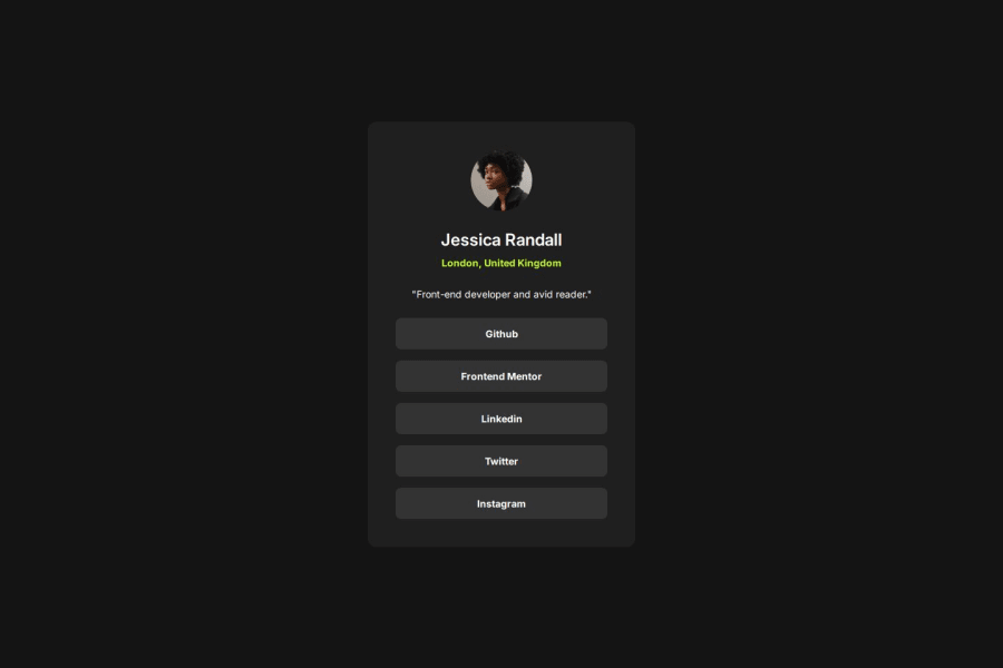
Design comparison
Solution retrospective
Nothing specific stands out, but I’m open to all feedback! One area I’m unsure about is how I handled the width of the card in the main.css file, so any advice on that would be particularly helpful.
Thanks in advance for taking a look!
Community feedback
- @StroudyPosted about 2 months ago
Hello again my friend, Incredible work on this! You’re making great strides, and I have a couple of suggestions that might push it even further…
- I would put these into a
<ul> <li>
, and the text should be wrapped with a<a>
so it is accessible with a keyboard using the tab key, Using an<a>
tag for navigation is semantically correct, improves accessibility for screen readers, and ensures consistent behavior across browsers, unlike a<button>
or a<div>
not intended for links.
<div class="profile__links"> <a href="#" class="profile__link">Github</a> <a href="#" class="profile__link">Frontend Mentor</a> <a href="#" class="profile__link">Linkedin</a> <a href="#" class="profile__link">Twitter</a> <a href="#" class="profile__link">Instagram</a> </div>
-
I think you could benefit from a plugin on VS code called Prettier, It will format your code make it more easily readable.
-
This does not matter that much at this stage but something to be mindful of for SEO(Search Engine Optimisation),
<meta>
description tag missing that helps search engine determine what the page is about, Something like this<meta name="description" content="description goes here" />
-
For future project, You could download and host your own fonts using
@font-face
improves website performance by reducing external requests, provides more control over font usage, ensures consistency across browsers, enhances offline availability, and avoids potential issues if third-party font services become unavailable. Place to get .woff2 fonts
I hope you’re finding this guidance useful! Keep refining your skills and tackling new challenges with confidence. You’re making great progress—stay motivated and keep coding with enthusiasm! 💻
Marked as helpful0@thibault-devergePosted about 2 months agoHi @Stroudy,
Thank you so much for the great feedback—it's always appreciated! Your suggestion about using a <ul> for the list of links is spot on. I had used anchor elements for semantics, but I didn’t consider structuring them as a list of social media links. That’s a great idea, and I’ll be sure to implement it moving forward.
I’m already using Prettier to help with formatting. I’ve customized a few settings for personal preference, but it’s been a huge productivity boost overall.
The meta tag advice is really valuable. I realize I need to dive deeper into SEO and optimize my code accordingly—I'll make sure to apply that knowledge in my next project. Thanks for pointing that out!
As for the font-face, you're right—Frontend Mentor makes it convenient, but for a real-world scenario, I would definitely download and implement it manually. Thanks again for the resource!
Wishing you happy coding !
1@StroudyPosted about 2 months agoHey @thibault-deverge, No problem at all, I'm glad you found some of the information helpful, I look forward to seeing some more from you.
0 - I would put these into a
- @LapupehPosted about 2 months ago
Excellent job done!
- Your solution includes semantic HTML, and also accessible
- It is responsive and also looks good on a range of screen sizes
- It is well structured, readable, and also helpful to me. WELL DONE!
0
Please log in to post a comment
Log in with GitHubJoin our Discord community
Join thousands of Frontend Mentor community members taking the challenges, sharing resources, helping each other, and chatting about all things front-end!
Join our Discord