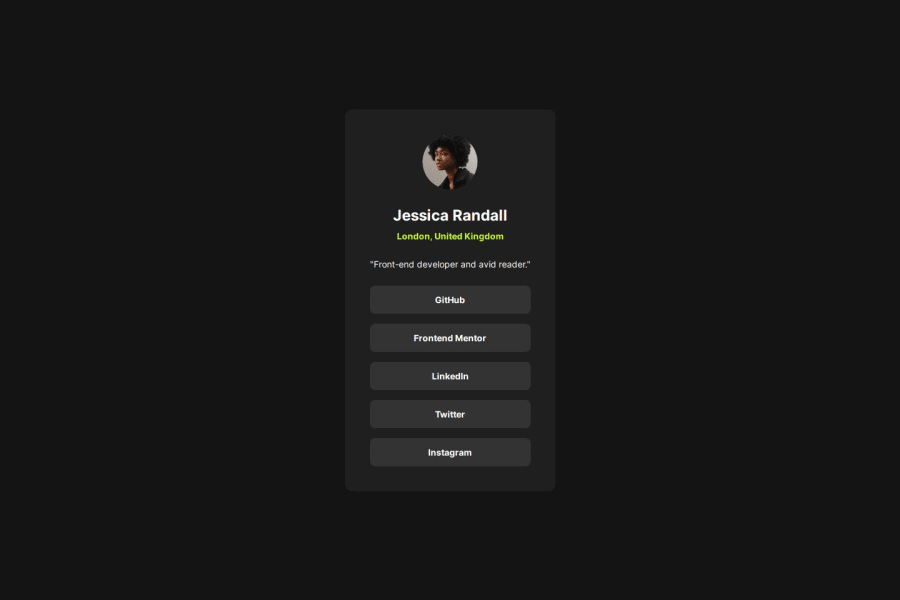


Design comparison

Solution retrospective
I am proud of the structure of the HTML and CSS. Although that is my view of it, I would always read and listen feedback for improvements.
What challenges did you encounter, and how did you overcome them?My challenge was one at the beginning: how to correctly displaying the font. I looked up on the internet why the font was not displaying correctly and change the code accordingly.
The other challenge was when I asked for feedback: a frontend mentor user pointed me to the issue I had with the height property on the html and body, and resolved it using min-height: 100svh on the body. That made me to read more about svh and why it is useful.
Anything that can be improved or new teachings will always be helpful for me.
Community feedback
Please log in to post a comment
Log in with GitHub
Join our Discord community
Join thousands of Frontend Mentor community members taking the challenges, sharing resources, helping each other, and chatting about all things front-end!
Join our Discord