Not Found
Not Found
Not Found
Not Found
Not Found
Not Found
Not Found
Not Found
Not Found
Not Found
Not Found
Not Found
Not Found
Not Found
Not Found
Not Found
Not Found
Not Found
Not Found
Not Found

Submitted

Social Links Profile - HTML and CSS only

@Francois085

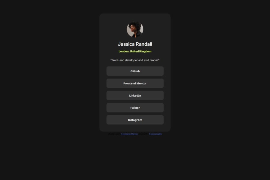
Desktop design screenshot for the Social links profile coding challenge

This is a solution for...

  • HTML
  • CSS
1newbie
View challenge

Design comparison


SolutionDesign

Solution retrospective


What are you most proud of, and what would you do differently next time?

I did not use the Figma design file and estimated the different sizes working on the png files.

What challenges did you encounter, and how did you overcome them?

I tried to use min-height and max-width but at the end I did not consider that it would bring more quality as the margin and font size are fixed. I might have missed the point of these CSS attributes and will search deeper on that.

What specific areas of your project would you like help with?

For project with limited width like this, would you still consider that font size and margin shall still be defined as a proportion of the screen size or could have a fixed size ? Thanks for your input.

Community feedback

@mariokreitz

Posted

<(^__^)>

Hi Francois (@Francois085),

Great job on the "Social Links Profile" project! Your work is coming along nicely, and I have a few suggestions to make it even better:

Hover Effect Cursor: It looks like the cursor pointer is missing on hover. Adding this will make it clear to users that the elements are interactive.

Subheadline Color: The green color under the picture seems to have a yellowish tint. Adjusting it to a more accurate green will align better with the design.

Vertical Alignment: The content alignment appears slightly off. Ensuring everything is centered both horizontally and vertically will improve the overall balance of the profile card.

Scrollbar: There shouldn’t be any scrollbars visible in the design. You might want to double-check the overflow settings.

Tiny Tip: Consider using Flexbox for easier and more efficient layout management. It’s perfect for handling alignment and spacing.

These tweaks will help polish your project further. Keep up the great work, and happy coding!

Marked as helpful

0

@Francois085

Posted

Dear Mario, Thanks a lot for your comments and tips. That is very helpfull. I will definitely work on the items alignment and the scroll bar as I suspected something wrong with those but were not quite sure of what was wrong. All the best for the future.

0

Please log in to post a comment

Log in with GitHub
Discord logo

Join our Discord community

Join thousands of Frontend Mentor community members taking the challenges, sharing resources, helping each other, and chatting about all things front-end!

Join our Discord