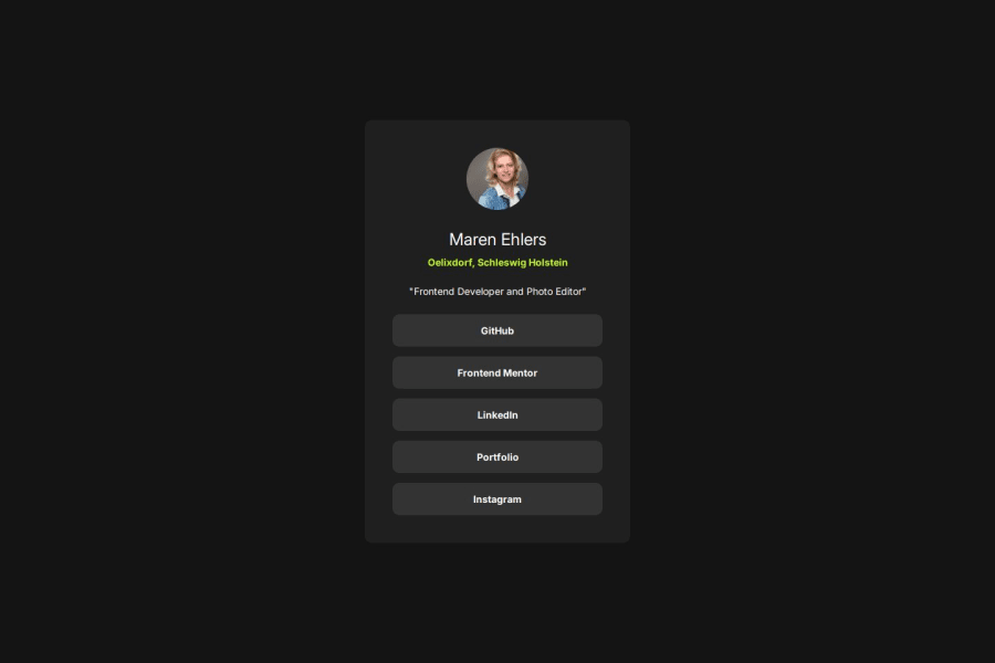
Not Found
Not Found
Not Found
Not Found
Not Found
Not Found
Not Found
Not Found
Not Found
Not Found
Not Found
Not Found
Not Found
Not Found
Not Found
Not Found
Not Found
Not Found
Not Found
Not Found

Submitted

Social-Links-Profil

@MarenOelixtown

Desktop design screenshot for the Social links profile coding challenge

This is a solution for...

  • HTML
  • CSS
1newbie
View challenge

Design comparison


SolutionDesign

Solution retrospective


What are you most proud of, and what would you do differently next time?

👉 I used the clamp() function for padding. This allows to ensure that the padding is larger on larger screens and automatically becomes smaller on smaller screens without explicitly using media queries.

What challenges did you encounter, and how did you overcome them?

💡I found the hint for the chrome extension PerfectPixel. Without having the figma design files, I tried to get as close as possible to the design template with the help of the extension.

Community feedback

geomydas 1,060

@geomydas

Posted

No need to use clamp for padding here. The padding doesn't change on from desktop to mobile or mobile to desktop in the design

0

@MarenOelixtown

Posted

@geomydas / Without having the Figma file, I thought to see a small difference in the design templates, but anyway.... thanks for pointing it out to me.

0
Sabine 40

@SabineEmden

Posted

I agree with @geomydas!

If you compare the desktop layout with the mobile layout, you can see that on desktop the social links are slightly wider than the paragraph directly above them. On mobile, the width of the links is closer to the width of the paragraph. That is, going from desktop to mobile, the width of the card shrinks to fit the smaller viewport width. The padding doesn't change.

Your section element is already a flex item. The defaults of flex-direction: row on the flex container and flex-shrink: 1 on section should give you the shrinking behavior of smaller viewport widths.

You used max-width: 384px on the section element. I used flex-basis to set the width. You could also use width. I'm not sure how max-width works on a flex item. I would have to look that up.

You may want to use rem for the width, not pixels. This would allow the section element to get wider, if the user changes the font size in the browser settings. That's up to you. I tried it in my browser, and the very large font size did not break your design.

0

Please log in to post a comment

Log in with GitHub
Discord logo

Join our Discord community

Join thousands of Frontend Mentor community members taking the challenges, sharing resources, helping each other, and chatting about all things front-end!

Join our Discord