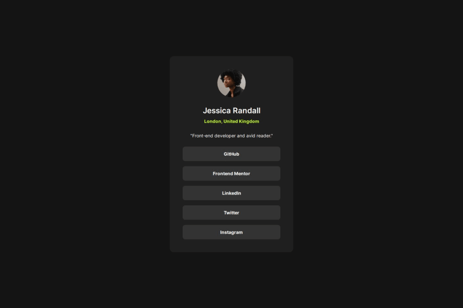
Design comparison
SolutionDesign
Solution retrospective
What are you most proud of, and what would you do differently next time?
I'm most proud of the use of semantic HTML elements, accessible & keyboard navigable focus styles!
What challenges did you encounter, and how did you overcome them?When wrapping the links in a tags I noticed that styles such as gap, and w-full were not working as expected. After remembering that a tags are inline elements and will not behave the same as block elements, I was able to fix the issue. A quick modification of the elements display property to "inline-block" allowed for the layout to work how I wanted it to.
What specific areas of your project would you like help with?Guidance on implementing ARIA roles, improving keyboard navigation, and ensuring compatibility with screen readers would be valuable!
Community feedback
Please log in to post a comment
Log in with GitHubJoin our Discord community
Join thousands of Frontend Mentor community members taking the challenges, sharing resources, helping each other, and chatting about all things front-end!
Join our Discord
