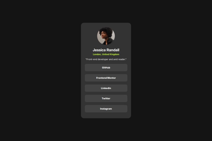
Design comparison
Solution retrospective
Done my third one for the day and used all my past learnings which I thought to forget, but with little of practice, all comes to place. Moving forward to build long single page sites.👩💻😊
Community feedback
- @AdrianoEscarabotePosted 6 months ago
Hello Gobinath, how are you? I was really pleased with your project, but I’d like to offer some advice that might help:
I noticed that your component is not centralized. To resolve this, we can do the following:
body {
    font-family: "Inter", sans-serif;
    display: grid;
    place-content: center;
    height: 100vh;
    background-color: hsl(0, 0%, 8%);
}
The rest is spot on.
Hope it’s helpful to you. 👍
0 - @manish2120Posted 6 months ago
-
i don't know much about semantics, but you can also try using
headerandfootertag here frontend mentor let you know about the landmarks in there report after completing the project. -
Overall its good 🙂, but yea media queries are missing and u can also try color finder extensions to get to know the color of cards as we know we dont have access of figma files after 2 projects so yea we can't make it same as per design 😓.
0 -
Please log in to post a comment
Log in with GitHubJoin our Discord community
Join thousands of Frontend Mentor community members taking the challenges, sharing resources, helping each other, and chatting about all things front-end!
Join our Discord
