Submitted 6 months ago
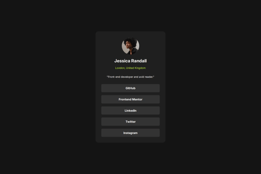
Social links pofile card using react, css, and create-react-app
#react
@geraldesteban
Design comparison
SolutionDesign
Solution retrospective
What are you most proud of, and what would you do differently next time?
Created my first react challenge and doing it smoothly
What challenges did you encounter, and how did you overcome them?Handling the src links because it was my first time using package tool "create-react-app".
What specific areas of your project would you like help with?I will do a components base rather than editing it in 1 file.
Community feedback
Please log in to post a comment
Log in with GitHubJoin our Discord community
Join thousands of Frontend Mentor community members taking the challenges, sharing resources, helping each other, and chatting about all things front-end!
Join our Discord
