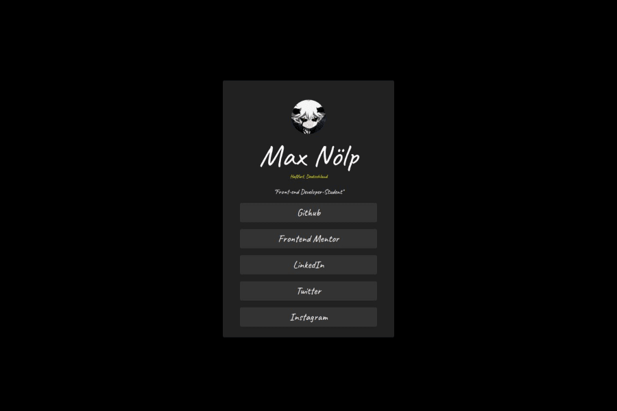
Design comparison
SolutionDesign
Solution retrospective
What are you most proud of, and what would you do differently next time?
i don´t use a Button from a website, i create my own one and center the flexbox
Community feedback
- @Alex-Archer-IPosted 5 months ago
Hi! Interesting work, it's always cool to experiment with design =)
Here is a few tips:
- Use
min-height
instead ofheight
on thebody
tag in case if the user's devise have smaller screen than content. - Almost the same about
.article
- try not to explicitly set height for container elements. In real projects there could be the cases when content might changed, so it's better whenheight
of a container depends on the content. - It is better use
ul
andli
tags for the buttons-links because of semantic. To keep html leaner you could puta
directly intoli
, buttons aren't really necessary here.
Oh, and the
padding
property haven'tauto
value.Anyway, cool job, keep doing =)
Marked as helpful0@maxnoelpPosted 5 months ago@Alex-Archer-I thanks for ur comment, i learn since 2 weeks. I will keep in my mind :)
1@Alex-Archer-IPosted 5 months ago@maxnoelp That's cool, good luck with your studying =) Fell free to ask or comment if you need =)
1@maxnoelpPosted 5 months ago@Alex-Archer-I thanks, it is a lot to learn :) I may take you up on that later.
1 - Use
- @umeshsuwalPosted 5 months ago
The font is little bit hard to read, it's not good for user experience
0
Please log in to post a comment
Log in with GitHubJoin our Discord community
Join thousands of Frontend Mentor community members taking the challenges, sharing resources, helping each other, and chatting about all things front-end!
Join our Discord