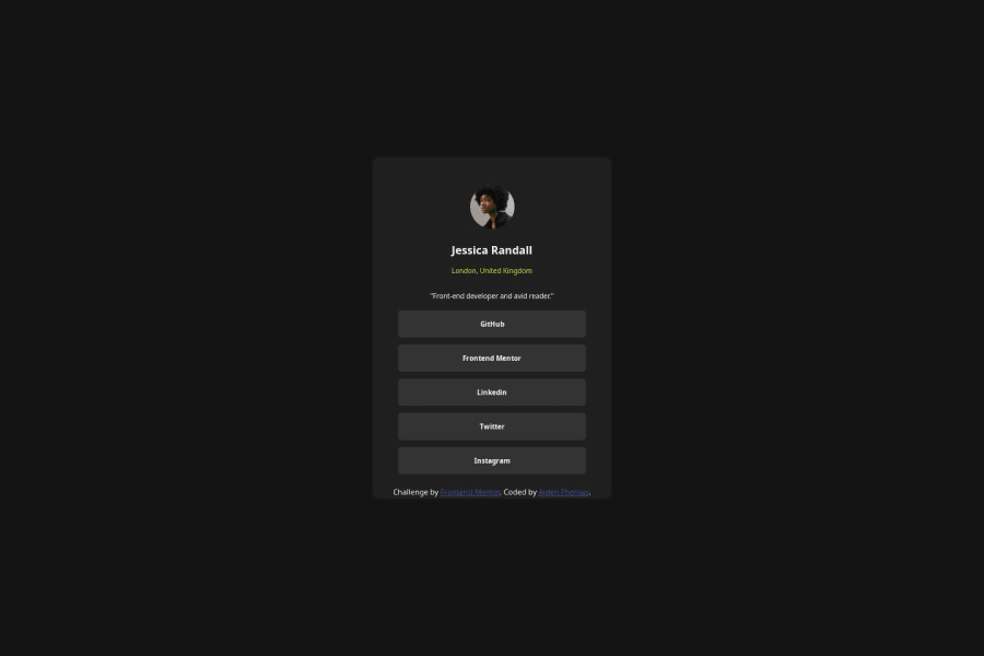
Design comparison
SolutionDesign
Solution retrospective
What are you most proud of, and what would you do differently next time?
I liked that I planned the page before staring work. I thought about how the page was structured and what css will likely be used. Next time I will try to get a better understanding of grid layouts so I don't have to add as much manual movements to elements.
What challenges did you encounter, and how did you overcome them?When starting, I could not make grid layout work the way I wanted to but after researching grid and other methods such as margin top I was able to place elements at the correct places.
What specific areas of your project would you like help with?I would like people to explain what improvements can be made to my approach of layouts as I know my consistent use of margin top is bad.
Community feedback
Please log in to post a comment
Log in with GitHubJoin our Discord community
Join thousands of Frontend Mentor community members taking the challenges, sharing resources, helping each other, and chatting about all things front-end!
Join our Discord
