

Design comparison

Solution retrospective
I am most proud of how I used a different and more nuanced style of coding to do this (classes instead of inline).
What challenges did you encounter, and how did you overcome them?I encountered many challenges, especially in regards to using flex & grid, but it was solved using margins.
What specific areas of your project would you like help with?I would like fellow coders to teach me more effective ways of making responsive elements
Community feedback
- P@brandontaylor1Posted 4 months ago
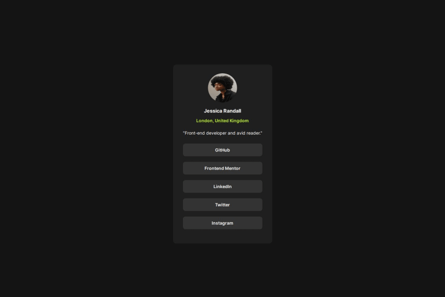
Udit - Like your design overall! Great job! One area I would like you to focus in on is the image itself. It looks slightly smushed down. It could be that the dimensions on the image itself aren't even, ex. height:50px, width: 50px. With square dimensions, you can then use border-radius to make the circular image. Hope that helps!
0

Please log in to post a comment
Log in with GitHubJoin our Discord community
Join thousands of Frontend Mentor community members taking the challenges, sharing resources, helping each other, and chatting about all things front-end!
Join our Discord