

Design comparison

Solution retrospective
Finishing the project. Try not to use solutions for help.
What challenges did you encounter, and how did you overcome them?Centering the card or table, as I called the container. I got help from my coding Instructor.
What specific areas of your project would you like help with?Css.
Please log in to post a comment
Log in with GitHubCommunity feedback
- P@danielmrz-dev
Hello there!
Congrats on completing the challenge! ✅
Your solution looks great!
📌 It's recommended to use semantic HTML elements like
<ul>and<li>for creating lists. This ensures that your code is more accessible, maintainable, and semantically meaningful.Here's and example on how you can refactor your code:
After Refactoring
<ul class="list-container">
    <li><a href="#">Github</a></li>
    <li><a href="#">Frontend Mentor</a></li>
    <li><a href="#">LinkedIn</a></li>
    ...
</ul>
By using
<ul>and<li>, you convey the structure of your content more clearly, making it easier for screen readers and search engines to understand. Additionally, it aligns with best practices for HTML semantics.I hope you find this helpful!
Keep up the excellent work!
Marked as helpful - P@ZeroCool989
The design looks great. Just a couple of quick suggestions to make it even better:
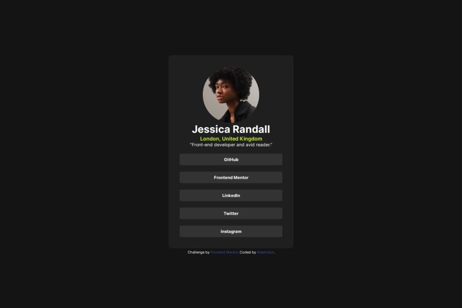
Centering: It might look more balanced if the header "Jessica Randall" and the subtitle are more centered within the card and also to Center the whole card it looks a little more left than center.
Footer Adjustment: Consider moving the footer information out of the main container that it look more like the original.
Really cool work so far! Keep it up!
Marked as helpful


Join our Discord community
Join thousands of Frontend Mentor community members taking the challenges, sharing resources, helping each other, and chatting about all things front-end!
Join our Discord