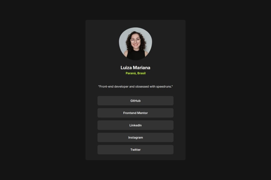
Design comparison
Solution retrospective
I'm proud that I did it. I learned to do some thigs in less code and I would like to practice more of that. (sorry not my fisrt lang :c)
Community feedback
- @RasMurph420Posted about 1 month ago
Your code looks great! It successfully creates a well-structured and styled social links profile page.
Suggestions for Improvement:
Responsiveness: Currently, the width of the card is fixed at 500px. Consider using media queries to make the layout responsive and adapt to different screen sizes.
Font weight: While you've set font weight for different elements, you can explore further adjustments for subtle visual hierarchy.
Margin and padding: The margin and padding values can be further fine-tuned for better spacing and balance within the card.
Overall, you've built a solid foundation for your social links profile. With these minor tweaks and further exploration, you can create an even more polished and responsive design
0
Please log in to post a comment
Log in with GitHubJoin our Discord community
Join thousands of Frontend Mentor community members taking the challenges, sharing resources, helping each other, and chatting about all things front-end!
Join our Discord