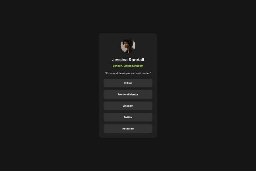
Design comparison
Solution retrospective
i like how no grid was used! flexbox ftw
next time i'd probably make the code more readable, as the utility classes and the general styles aren't really separated
What challenges did you encounter, and how did you overcome them?there were problems with centering the text in the buttons, but i just thought hard about them and fixed them :)
Community feedback
- P@juliusalbertoPosted 9 months ago
I like your code - it's readable. It also includes semantic HTML, things like h1, div, a, are properly used (unlike mine!). It looks good on a range of screen sizes (I tried it on iPad and iPhone).
I can read your code, so it's readable enough for me. It's well structured (as I mentioned earlier, you use h1, div, and a properly). It does not differ considerably from the design! Good job!
0
Please log in to post a comment
Log in with GitHubJoin our Discord community
Join thousands of Frontend Mentor community members taking the challenges, sharing resources, helping each other, and chatting about all things front-end!
Join our Discord
